



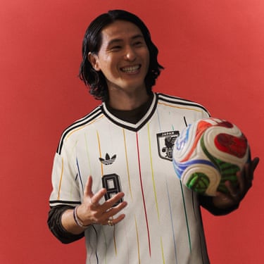
Japan away
Whatever Japan do at the World Cup, their away kit – modelled here, with a smile, by the attacking midfielder Takumi Minamino – has triumphed in the fashion tournament. It won a vote by football fans in April, and Four Four Two – oddly? – described it as “footballing porn”. It’s the 12 narrow multicoloured stripes that have got it noticed – one for each player on the pitch, and another for the fans. A nice message and a really, really, really nice kit.Photograph: AdidasShare
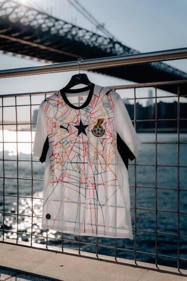
Ghana home
Like Japan’s away shirt, Ghana’s home kit has a pencil sketch element, but this one is more intricate. Using a spider’s web design, it references Ananse, the spider character who is part of the folklore stories of the Akan people in Ghana. With Ghana, there also needs to be a black star, as featured on the flag. It has pride of place here in the centre of the web.Photograph: Vincent Poetzsch/PumaShare
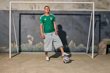
Mexico home
The US is dominating the headlines, but Mexico is a co-host of the tournament – and maybe the progressive’s choice to cheer on. They’ll be even happier to have a kit like this, which harks back to the much-loved design worn for France 1998, taking inspiration from the Aztec Piedra del Sol calendar, and using the colours of the country’s flag. Resistance by referencing an ancient indigenous culture has never looked so good. Especially if you wear the shirt with jorts, like the winger Roberto Alvarado.Photograph: Edwin Panneflek/AdidasShare
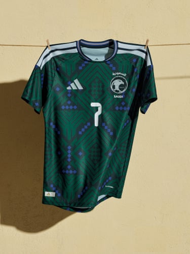
Saudi Arabia home
Inspired by patterns found in traditional Saudi architecture, and rendered in an unusual green with purple accents, this shirt has potential to become something of a classic – much like that 1998 Mexico kit inspired by Aztec designs. The addition of the emirate’s emblem, a date palm and two swords, on the centre at the back, is the kind of detail shirt collectors like.Photograph: AdidasShare
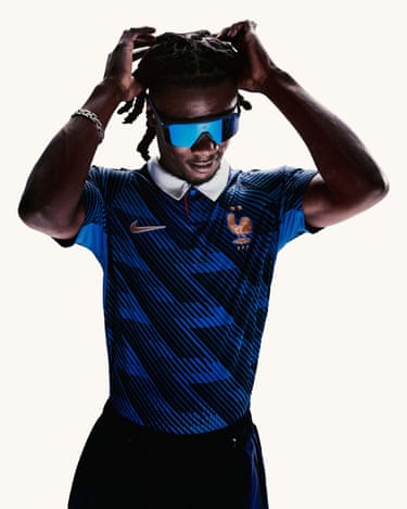
France home
Finalists in 2022, France have a decent shot of getting there again (they are second favourites). Whatever happens, they are fashion’s favourite team thanks to the outfits the players have been wearing to their training camp. Their home kit does this off-pitch flair some justice, as modelled by Eduardo Camavinga. The trademark bleu is given a bit of an upgrade with a zigzag pattern and the return of the white collar, a key part of France’s kit when they won the World Cup at home in 1998. Perhaps it bodes well for their success at this tournament. Photograph: NikeShare
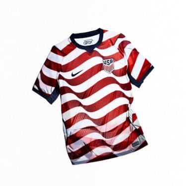
USA home
Cheering on the USMNT could be a bit cringe – since you’ll be joined by Donald Trump. But, grudgingly, we have to admit they have a great kit, one that is a massive shift from the white kits in 2022. It was loathed by fans and players drew straws when it came to being photographed in it. Fast-forward four years and players such as the midfielder Tyler Adams worked with Nike on a do-over. The wavy stripes of the national flag covering the kit are the striking result. One sure to be be a hit with fans as well as players.Photograph: NikeShare
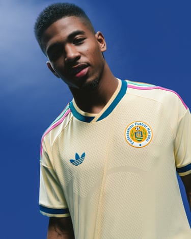
Curaçao away
Curaçao is the smallest country to play at a World Cup – with a population of about 158,000 – and you could say the kit punches above its weight. A clean, minimalist design lifted by its classic three stripes in the country’s colours and a simple trefoil. Let’s hope we see a lot of it in the tournament, as the minnow goes far. Photograph: AdidasShare
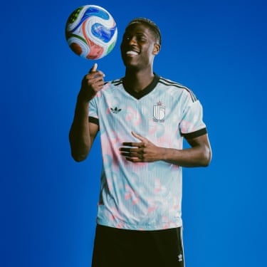
Belgium away
Belgium love a cultural reference for their kits. For Euro 2024 they used the colour scheme of Tintin’s outfit, complete with brown shorts. This time, their away kit (modelled here by Aston Villa’s Amadou Onana) is apparently inspired by René Magritte, Belgium’s most famous surrealist – even if the colour scheme looks a lot like Japan’s away shirt for the Women’s World Cup in 2023. The real Magritte reference comes on the inside, where it reads: “Ceci n’est pas un maillot” (“This is not a shirt”) in the artist’s signature script. Très arty.Photograph: AdidasShare
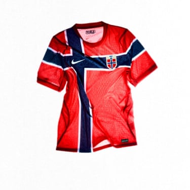
Norway home
A return to the World Cup after 28 years is something to celebrate. Norway’s kit, which harks back to one from 1997, has the kind of bold, flag-influenced design that is classic among football kits (see also Croatia and the checkerboard). GQ has praised it for the block colour effect – refreshing when most kits now have an underlying pattern. Their away kit, meanwhile, is all black. Photograph: NikeShare

Scotland away
Tartan may not seem a natural fit for football kits, but Scotland have made it work since the 90s. For their first World Cup since 1998, the home kit has broken with tradition – it has a lattice pattern in the trademark blue rather than tartan. It’s the away kit, modelled here by Bournemouth’s Ryan Christie, that is striking. Paying homage to the coral design worn in the mid-90s, this version has a cleaner look with no collar or button detailing, but still a skinny purple stripe. Perhaps we can expect the Tartan Army to turn coral. Photograph: AdidasShare
Explore more on these topics