
The 2026 World Cup is about to kick-off, and that means we are about to bear witness to the greatest array of international football shirts ever seen.
For the first time, 48 nations will take part in the men’s tournament, so we have reviewed every home and away shirt to make a 96-strong list of sartorial delights and disappointments in North America this summer.
It has been another strong showing from Adidas and Puma, while the good people at Jako deliver a surprise entrant into our top 10.
Why are Ghana wearing a spider web? What is that on Haiti’s hip? Why have Croatia made us angry? And which kit has won our highly coveted top spot? Please do tell us where we’ve gone badly wrong in the comments below.
So, from worst to best, from the visually upsetting to the optically arousing, here are our World Cup 2026 kit rankings.
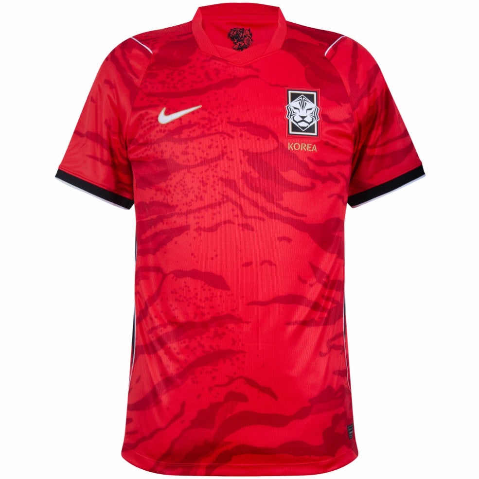
96. South Korea home: We have to start somewhere, and we’re starting with this ugly pattern. Are they hills, volcanoes, clouds? Over to Nike, who explain: “The head-to-toe camo print embodies an ambush of tigers striking together at any moment.” No it doesn’t.
 open image in gallery
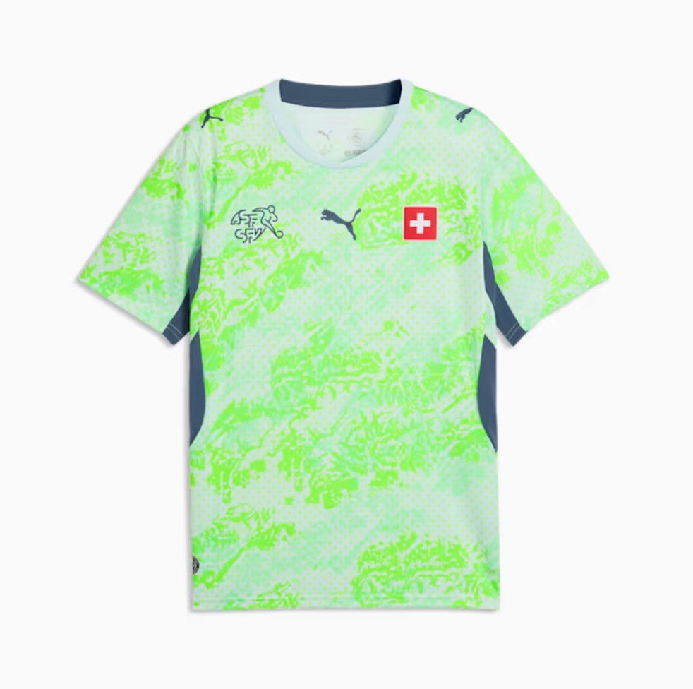
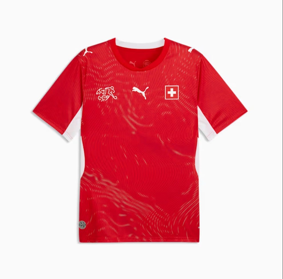
95. Switzerland away: It’s like a toddler wielding a highlighter pen got hold of the designs of an otherwise acceptable shirt. This is fine for goalkeepers, but otherwise, no thanks. Although as always with Switzerland, the crest is a big plus.
 open image in gallery
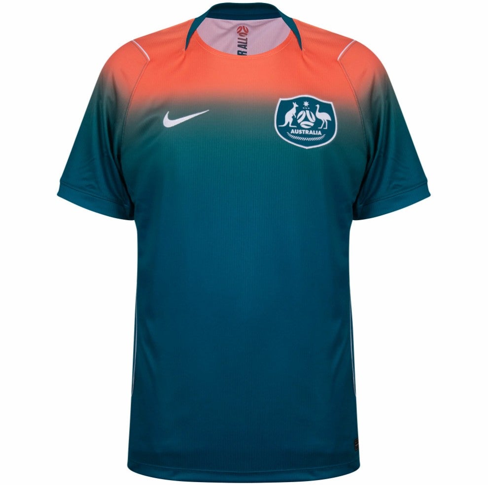
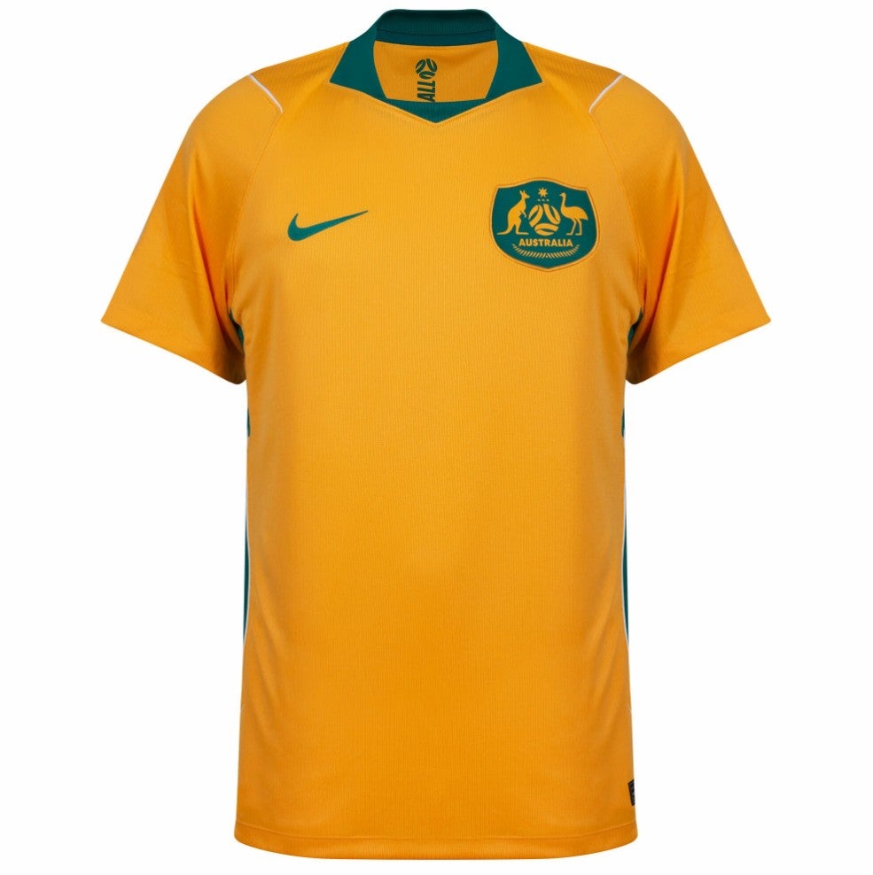
94. Australia away: A very bold fade from pink to green, and we’re not having it.
 open image in gallery
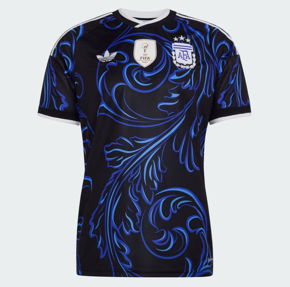
93. Argentina away: Garish, in a bad way.
 open image in gallery
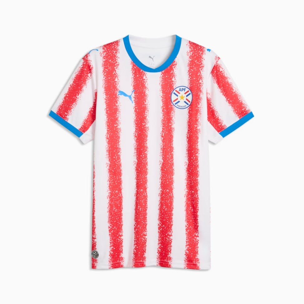
92. Paraguay home: Torn over whether this is a child’s crayon drawing or just a great shirt, and after much deliberation we’ve come down on the side of nursery artwork. Which, as we all know, goes straight in the bin.
 open image in gallery
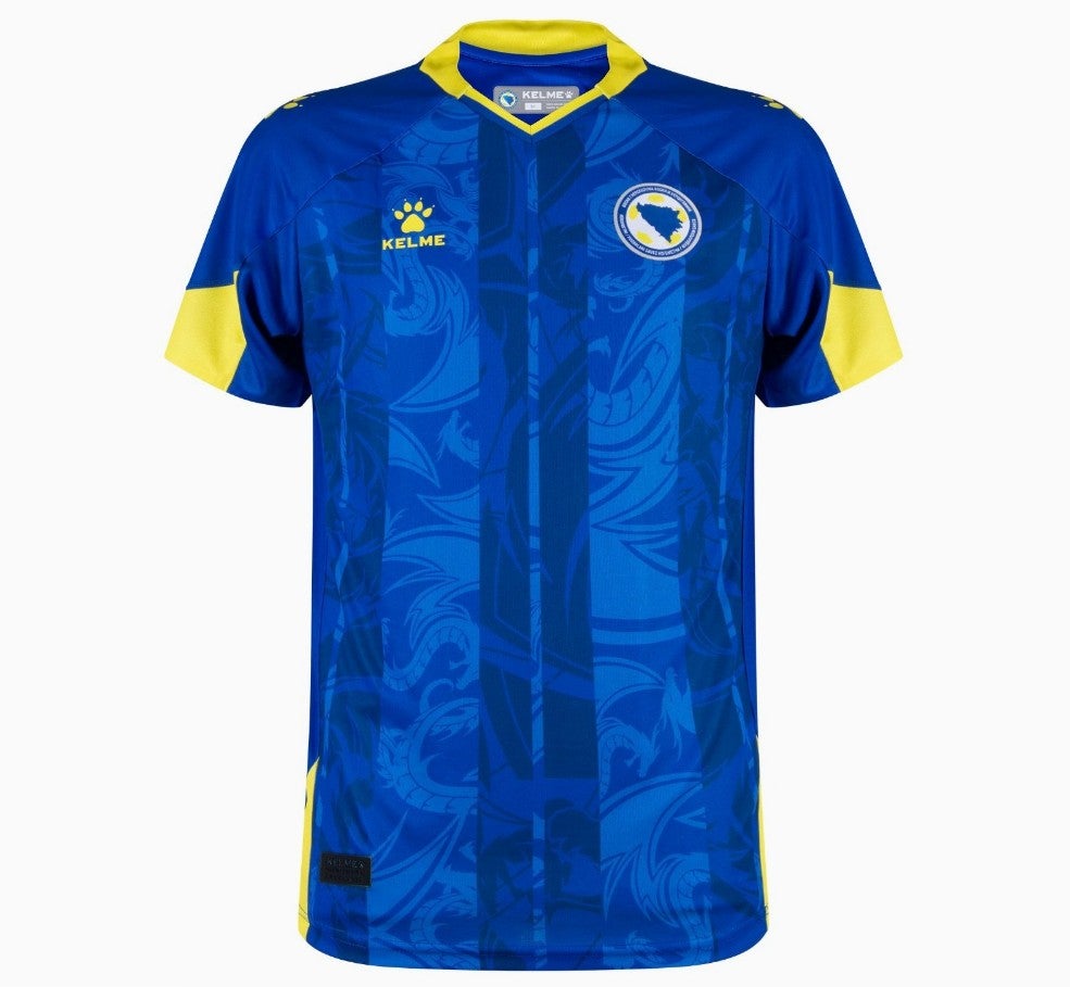
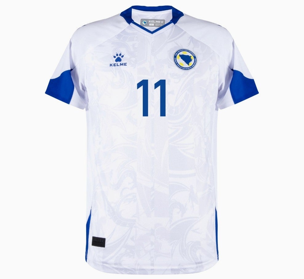
91. Bosnia and Herzegovina home: Welcome to the game, Kelme. And what have we got here? Two bold blue lines over the top of a dragon motif? That’s… that’s not a great start.
 open image in gallery
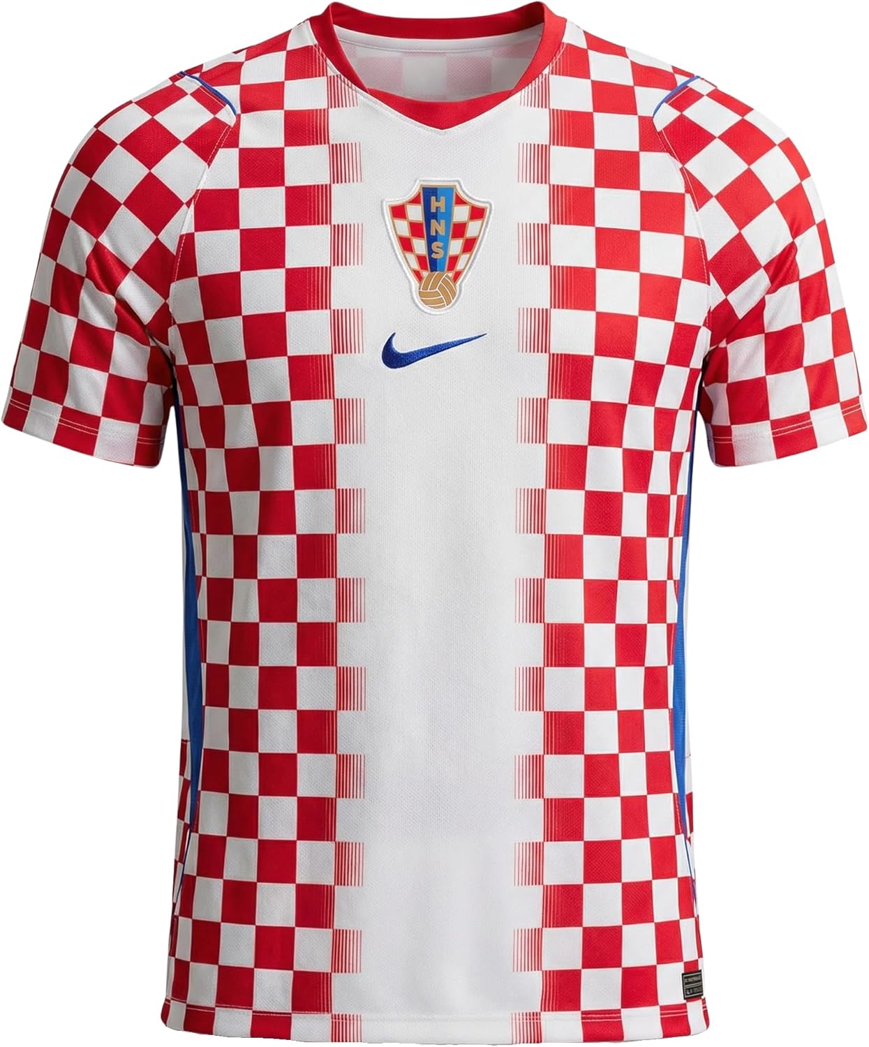
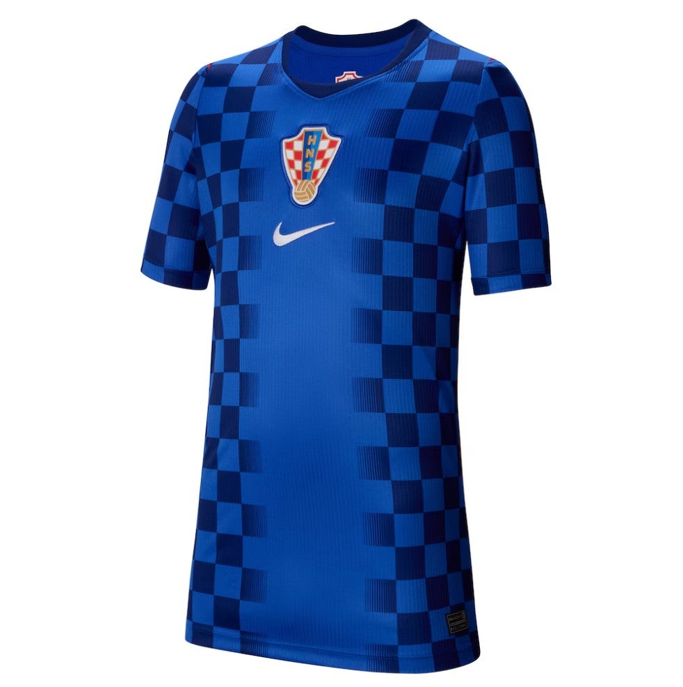
90. Croatia home: This is the only shirt on the list that makes us angry. Croatia is a great kit that doesn’t need reimagining, yet every tournament it gets fiddled! This time, someone at Nike has etch-a-sketched out the middle of a very attractive, near perfect Croatia shirt. And we’re unhappy about it.
 open image in gallery
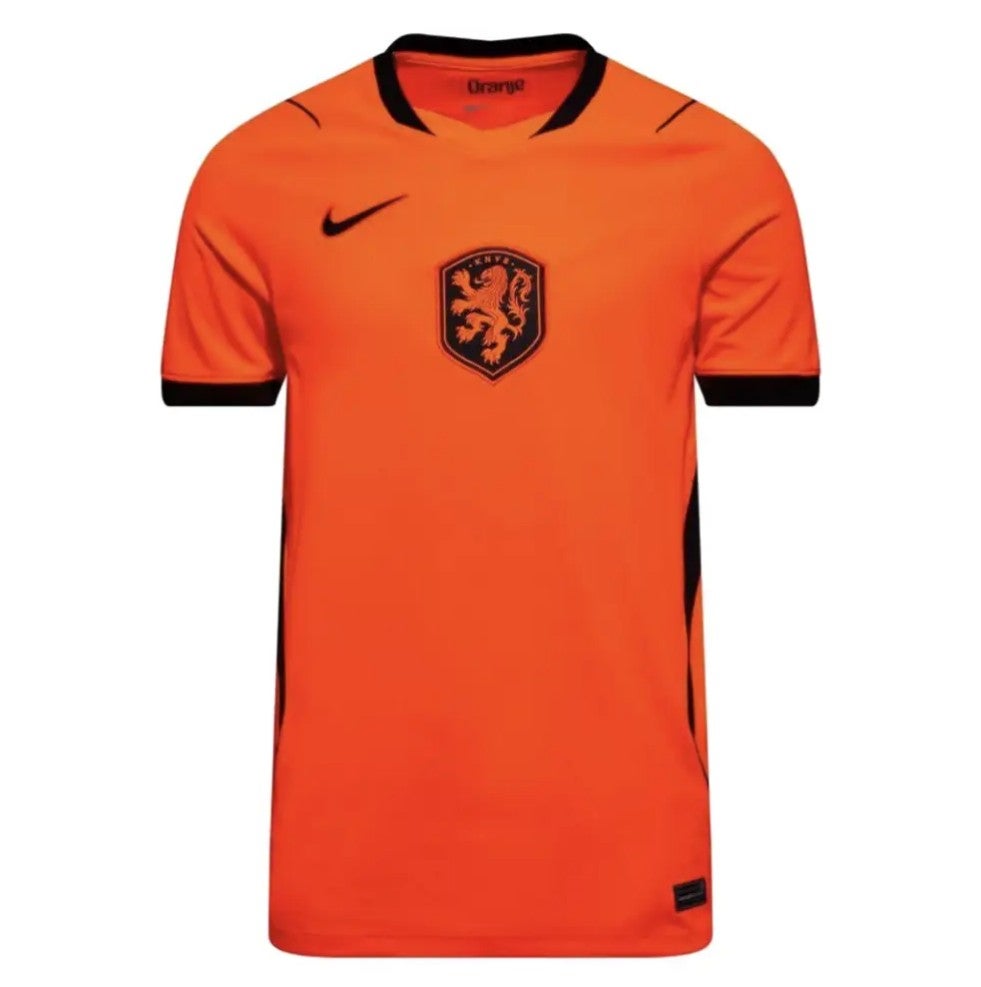
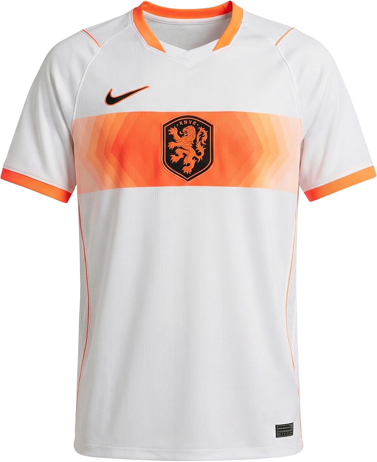
89. Netherlands home: The Dutch shirt should not be hard to get right but the fluorescent edge to this one is too much. The big central crest looks a bit village too.
 open image in gallery
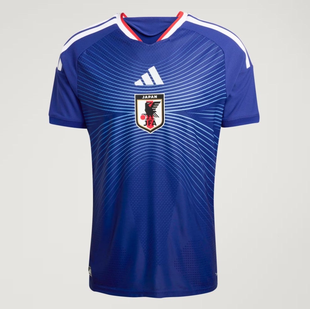
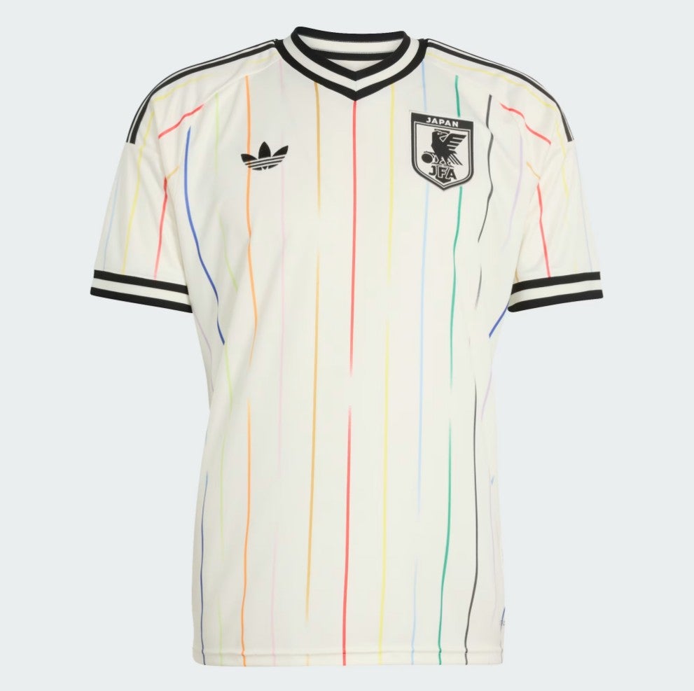
88. Japan home: Probably a bit harsh to place this 88th in a list of 96 shirts. But it’s a bit odd, and it’s here now.
 open image in gallery
87. Cape Verde away: A bit bland. Like eating dry toast. These lads flew to the World Cup signing and dancing on the plane. They deserve more.
 open image in gallery
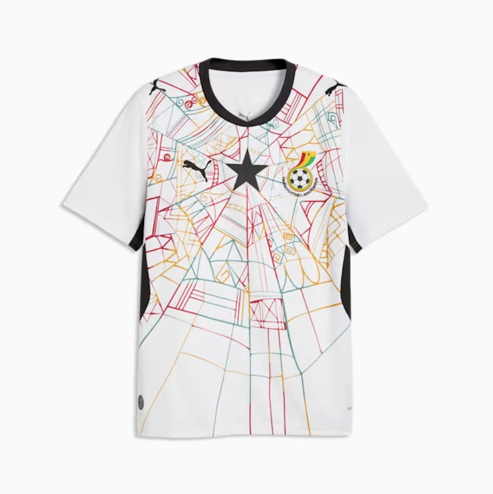
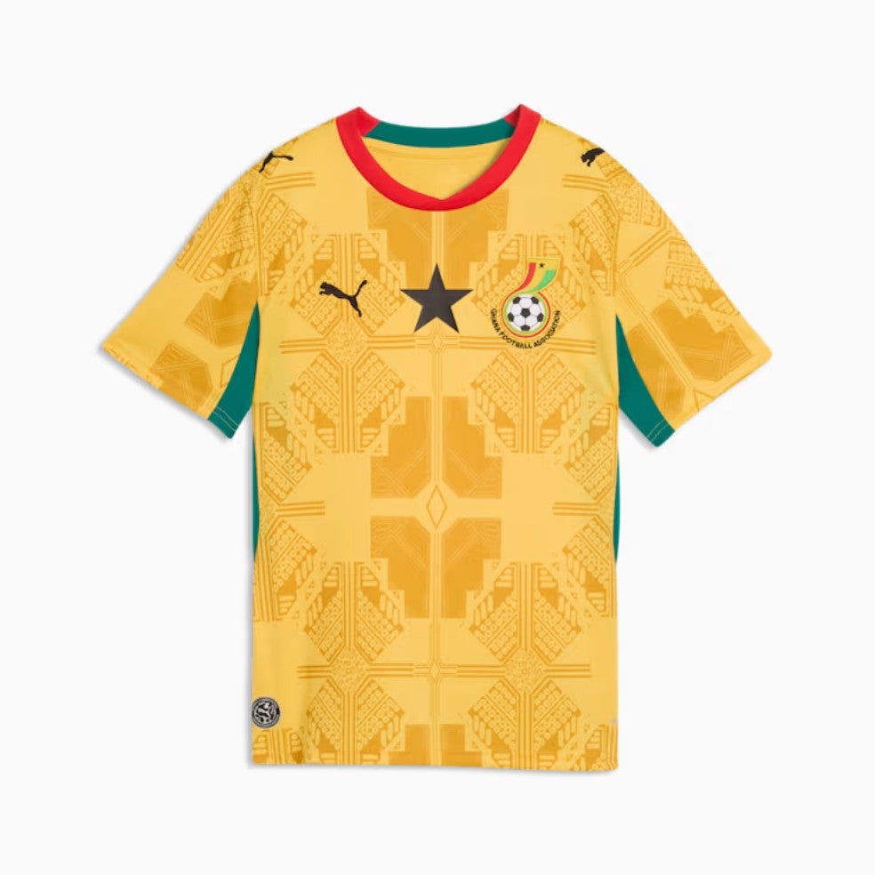
86. Ghana home: Sorry, Ghana. We’ve really tried to love this shirt. We’ve tried turning it around, upside down. We’ve squinted at it. We’ve read about the mythical spider in Ghanaian folklore it is meant to invoke. But ultimately, it is a bit of a mess.
 open image in gallery
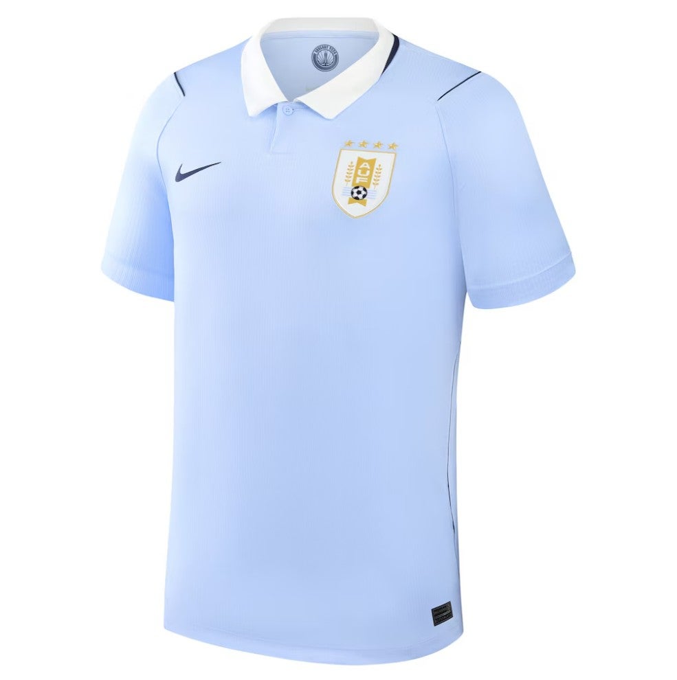
85. Uruguay away: Sorry but that’s a USA shirt and we won’t be taking any questions on the matter.
 open image in gallery
84. England away: The central crest gives it a slight Pro-Evo feel, which is not a good thing, and the background is a bit… weird.
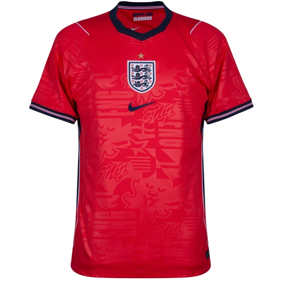 open image in gallery
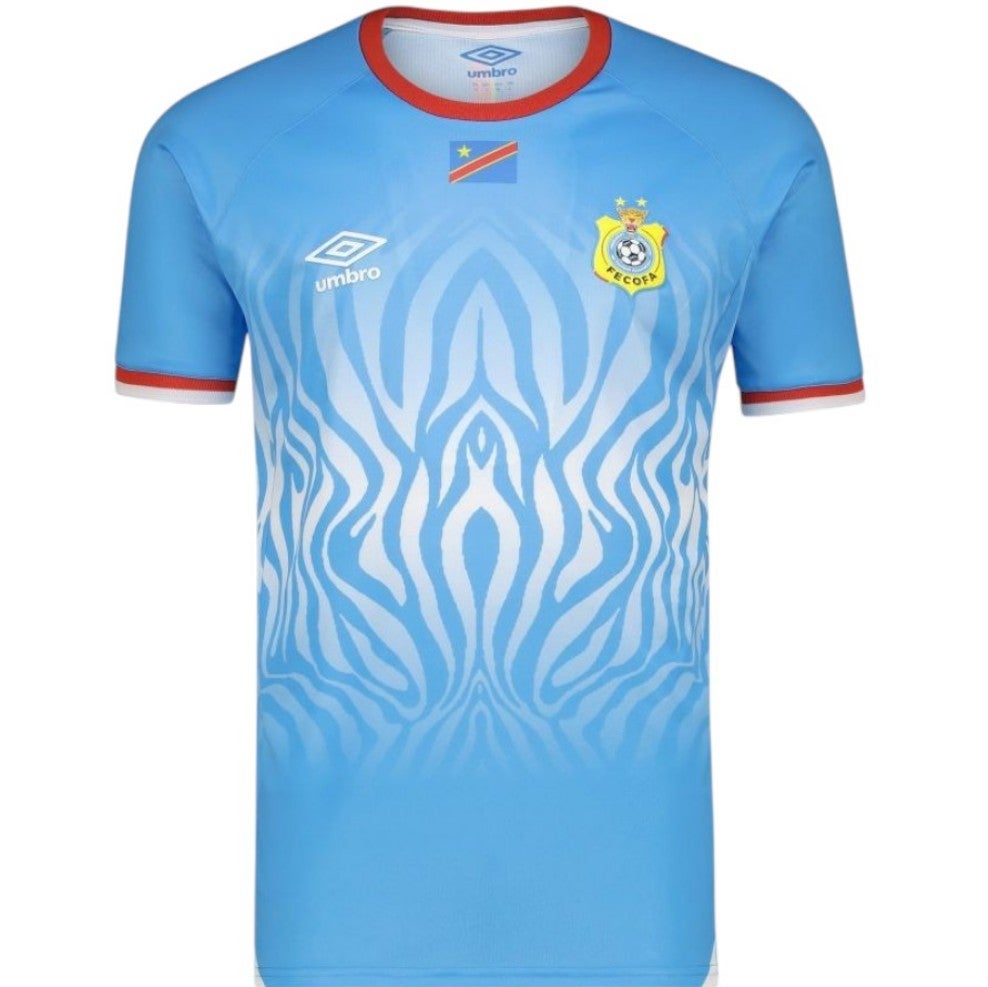
83. DR Congo away: Colour fades generally don’t work but this one is not bad, although it’s less DR Congo and more San Marino. Side point: it’s not dissimilar to the home colour, and being dissimilar really is the raison d’etre of any away shirt.
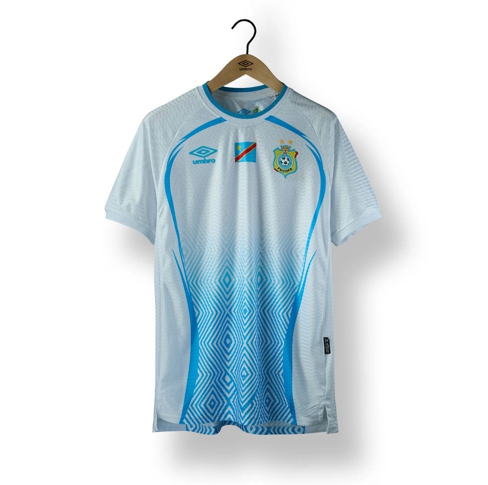 open image in gallery
82. France home: The lighter blue French shirts will always be better, and the zig-zag background is a bit much.
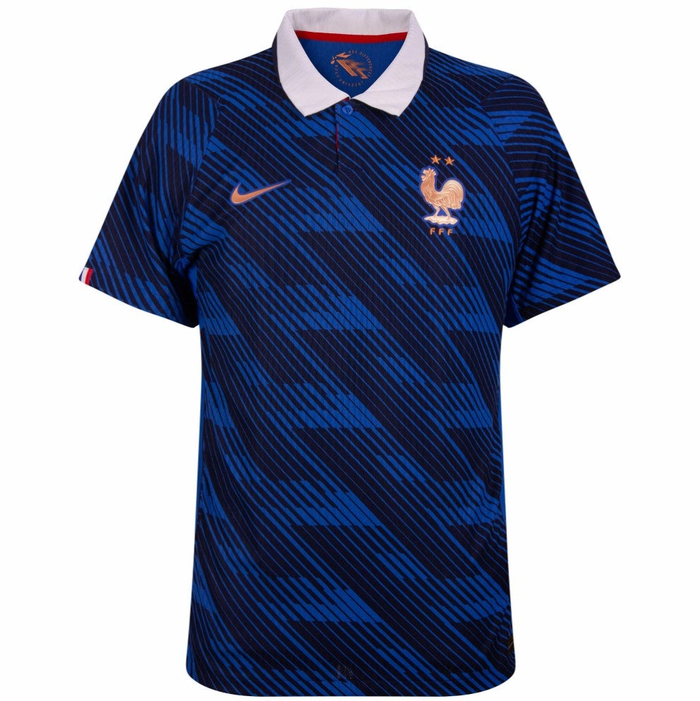 open image in gallery
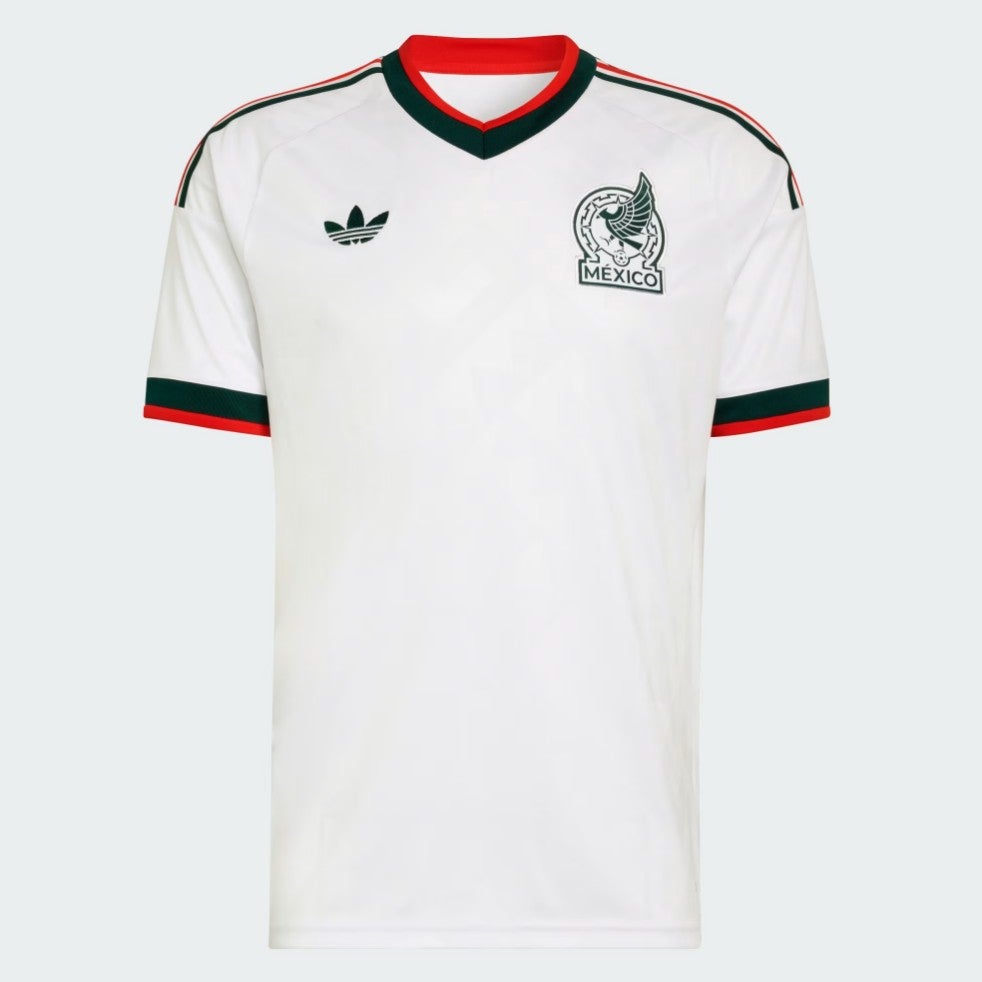
81. Mexico away: Not colourful enough to feel Mexican – it seems like something Germany should be wearing.
 open image in gallery
80. Netherlands away: A bit better from the Netherlands, this, but not much.
 open image in gallery
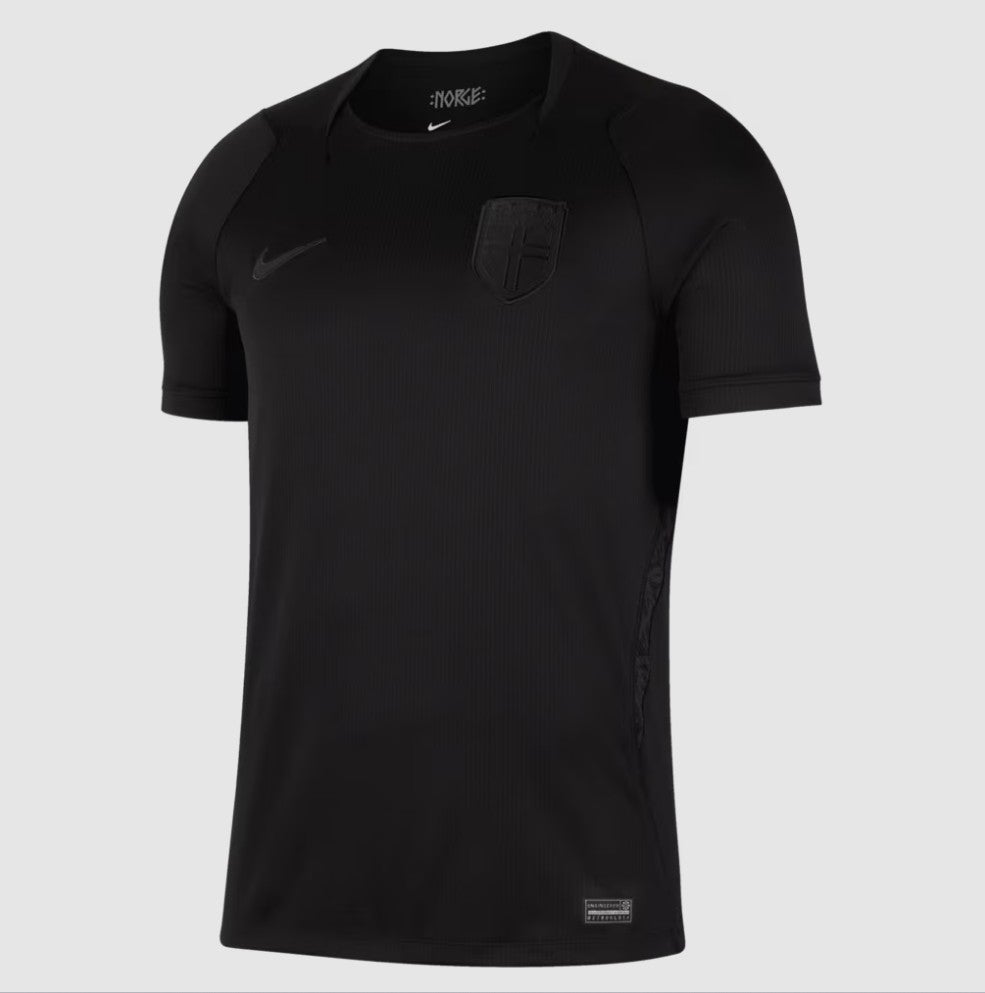
79. Norway away: We like simplicity, but is this too simple? “The stripped-down, striking visual honours the country’s viking history and celebrates the squad’s raw, Norse confidence,” claims Nike. Sorry, we’re not having it.
 open image in gallery
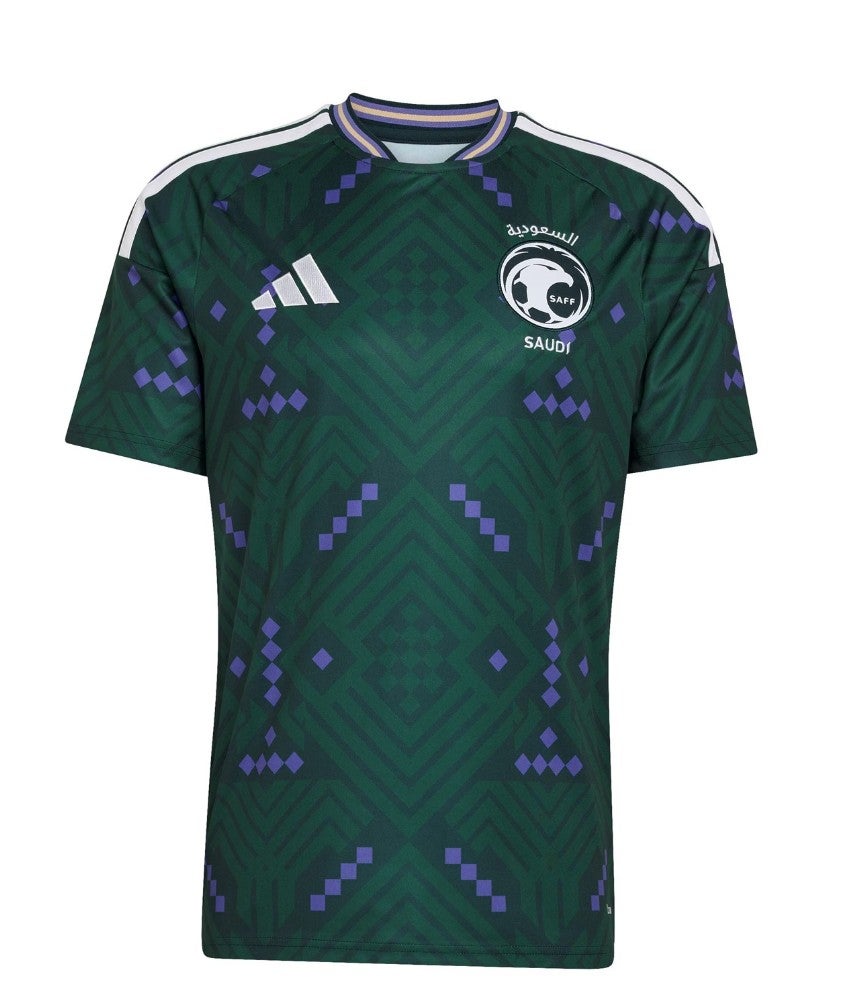
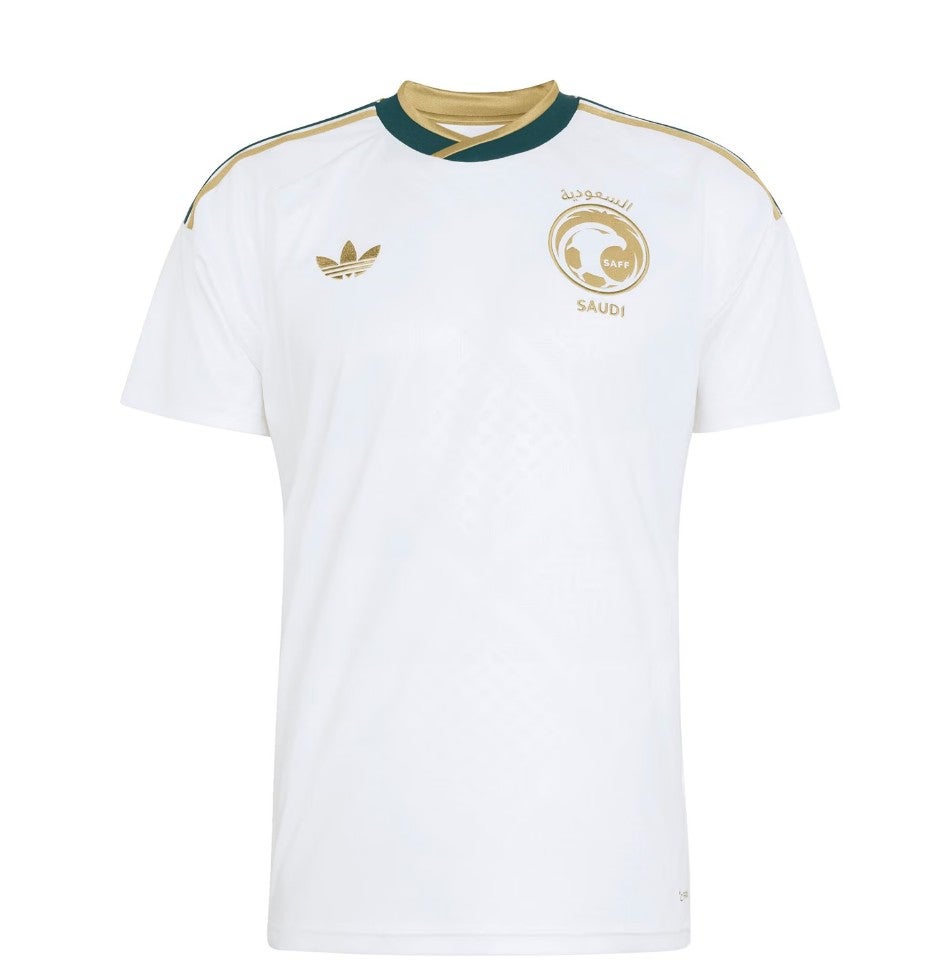
78. Saudi Arabia home: Makes us want to play Tetris.
 open image in gallery
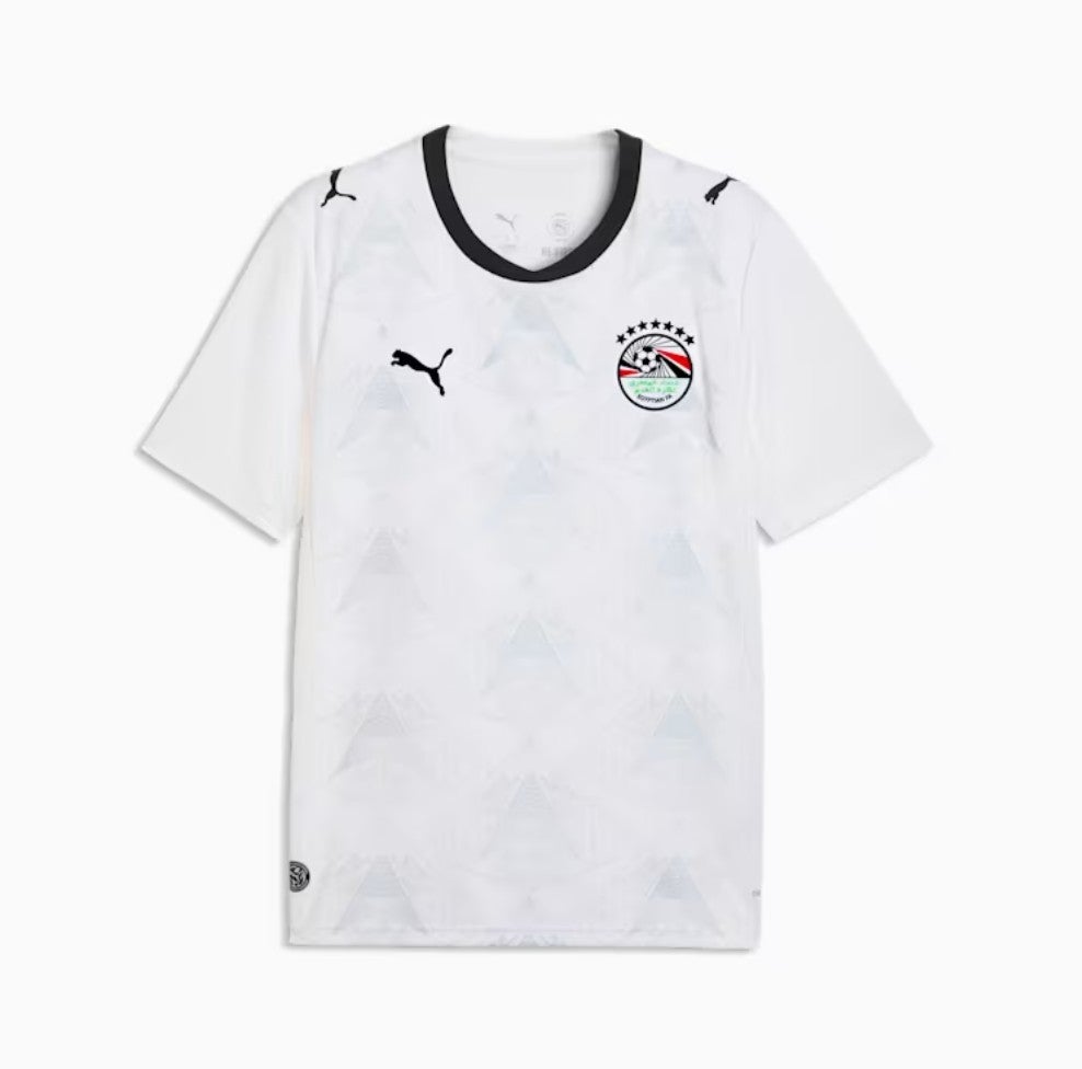
77. Egypt home: It’s giving a vibe of not actually having the image rights to the pyramids, like when the early versions of Pro Evolution Soccer didn’t own naming rights and players were called things like Ruud van Nistelstrom.
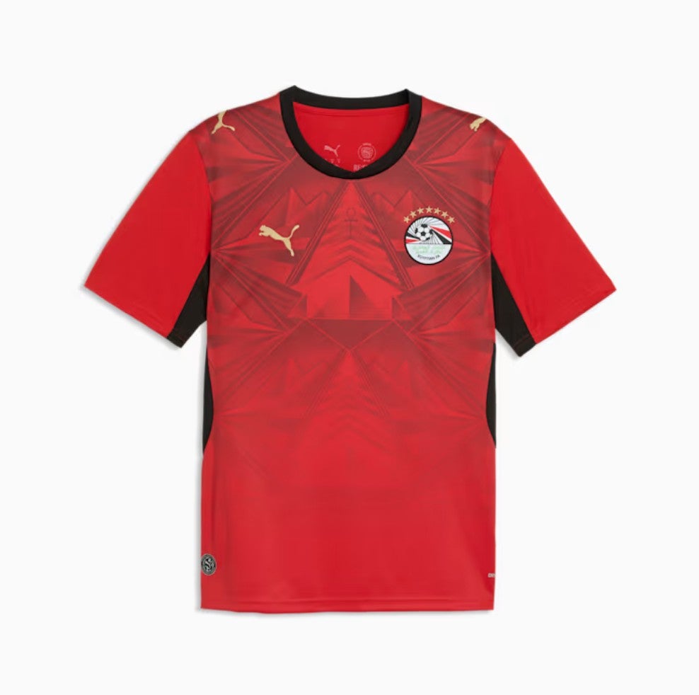 open image in gallery
76. Qatar away: There’s clean and simple, and then there’s just bland.
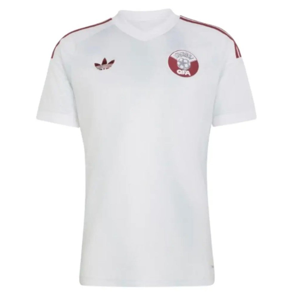 open image in gallery
75. Bosnia and Herzegovina away: Kelme are back for more, and this one is less of an assault on the iris, which is something. Or would that be the pupil, technically? Suppose really the retina is doing the heavy lifting, image-wise. Anyway, it’s unremarkable.
 open image in gallery
74. Curacao home: A little uninspiring, which is a shame, because as we will discuss later, the away shirt is a beauty.
 open image in gallery
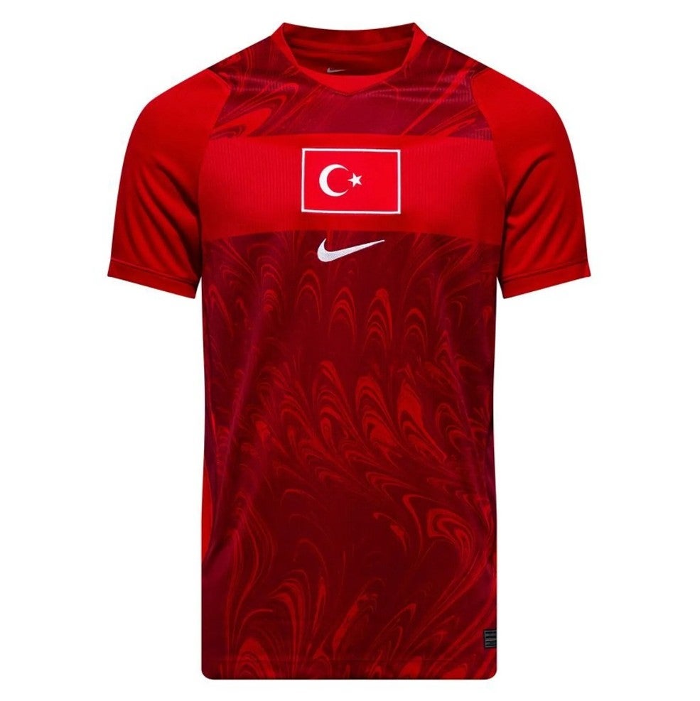
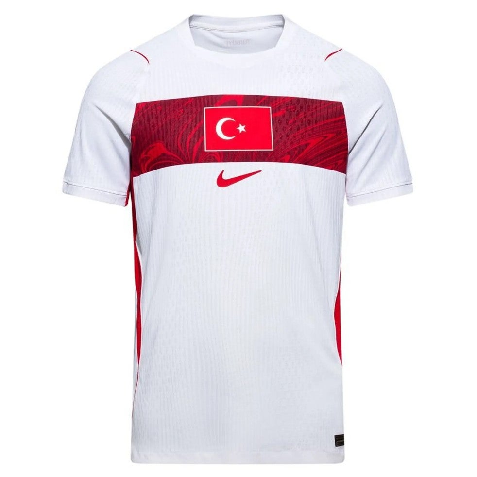
73. Turkey home: Quite a lot to dislike here. The strange pattern, the horizontal block line, the centralised crest. It’s just not working.
 open image in gallery
72. Switzerland home: A bit odd but broadly fine. And the crest is a big plus.
 open image in gallery
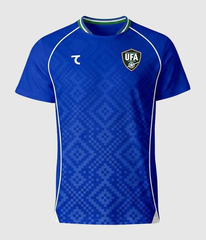
71. Uzbekistan home: Into the fray step 7Saber, with a similar blocky style to Saudi Arabia. The collar’s quite fun but the rest of it, we can take or leave.
 open image in gallery
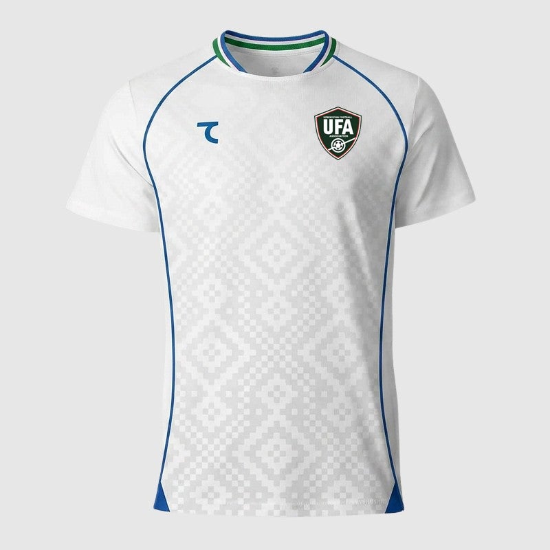
70. Uzbekistan away: Pretty similar.
 open image in gallery
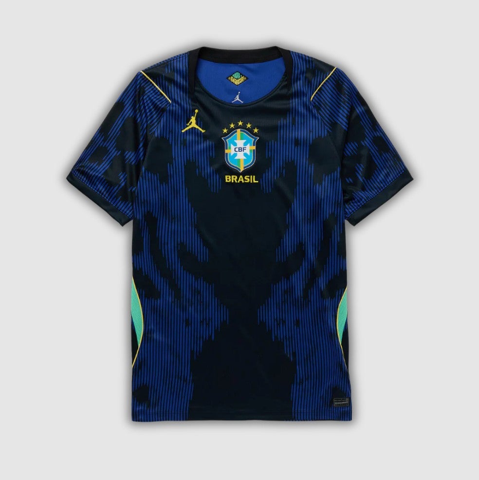
69. Brazil away: Vinicius and company will make this look good, we’ve no doubt, but it does look a bit like someone’s had a spillage.
 open image in gallery
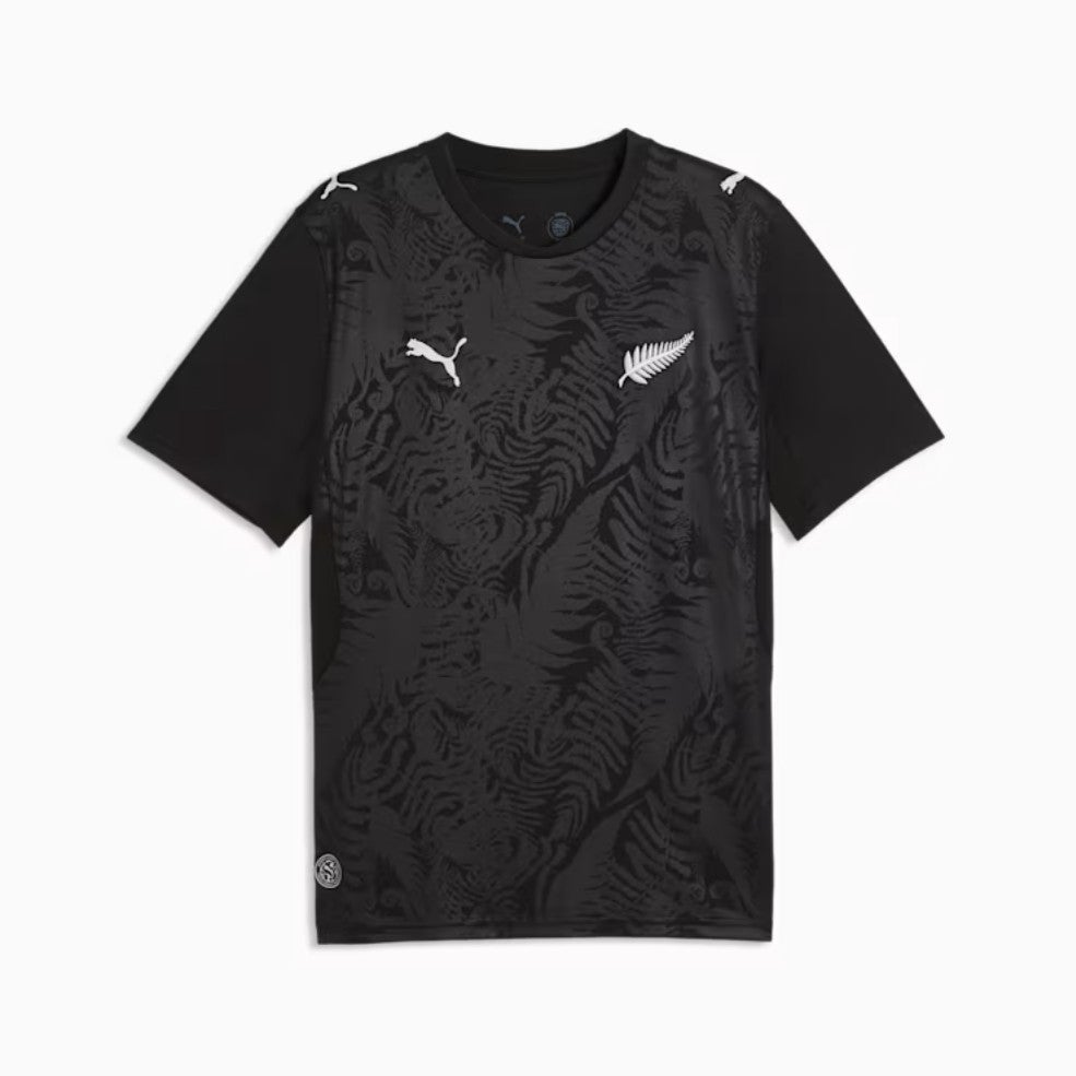
68. New Zealand home: It’s a little plain but the subtle fern-inspired background is pleasant enough. And black shirts are almost always cool, so that helps.
 open image in gallery
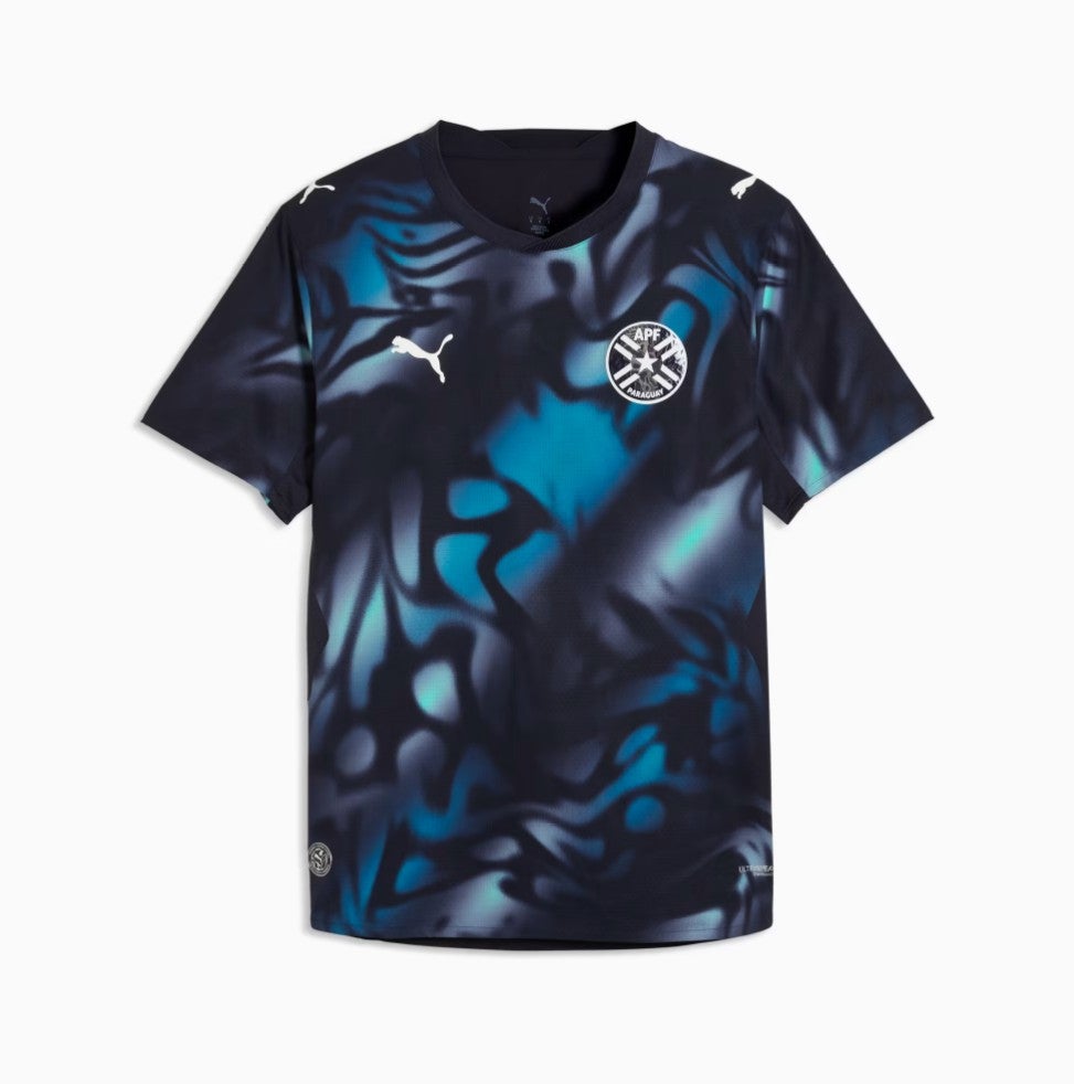
67. Paraguay away: Psychedelic.
 open image in gallery
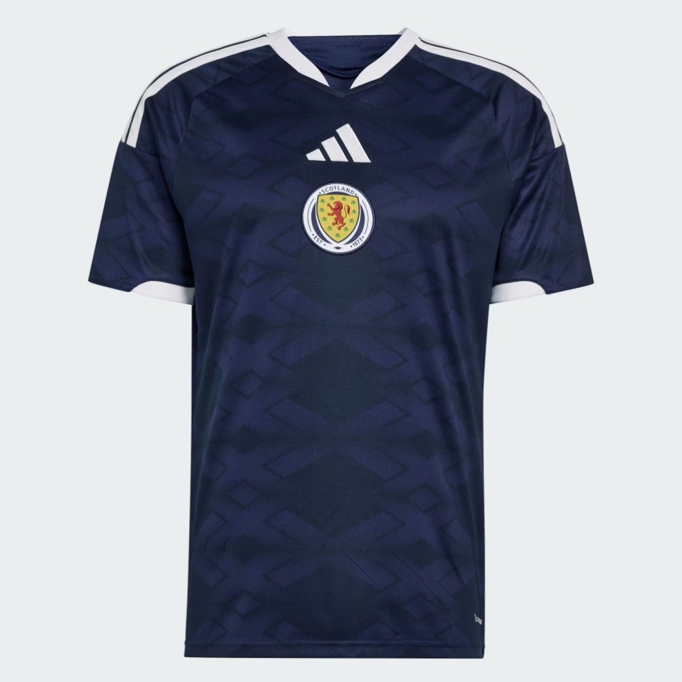
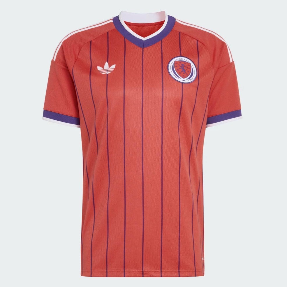
66. Scotland home: Classic, solid, no mistakes here. But a bit… safe?
 open image in gallery
65. Australia home: A little plain.
 open image in gallery
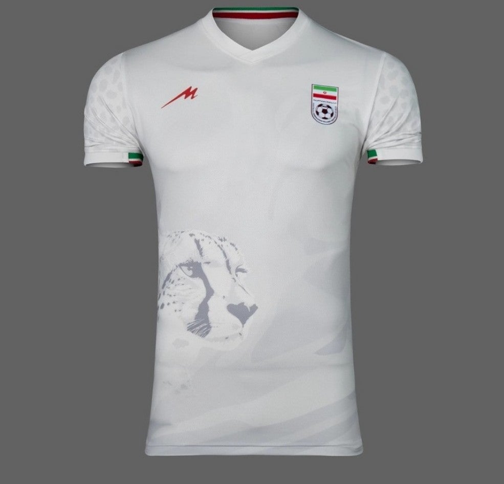
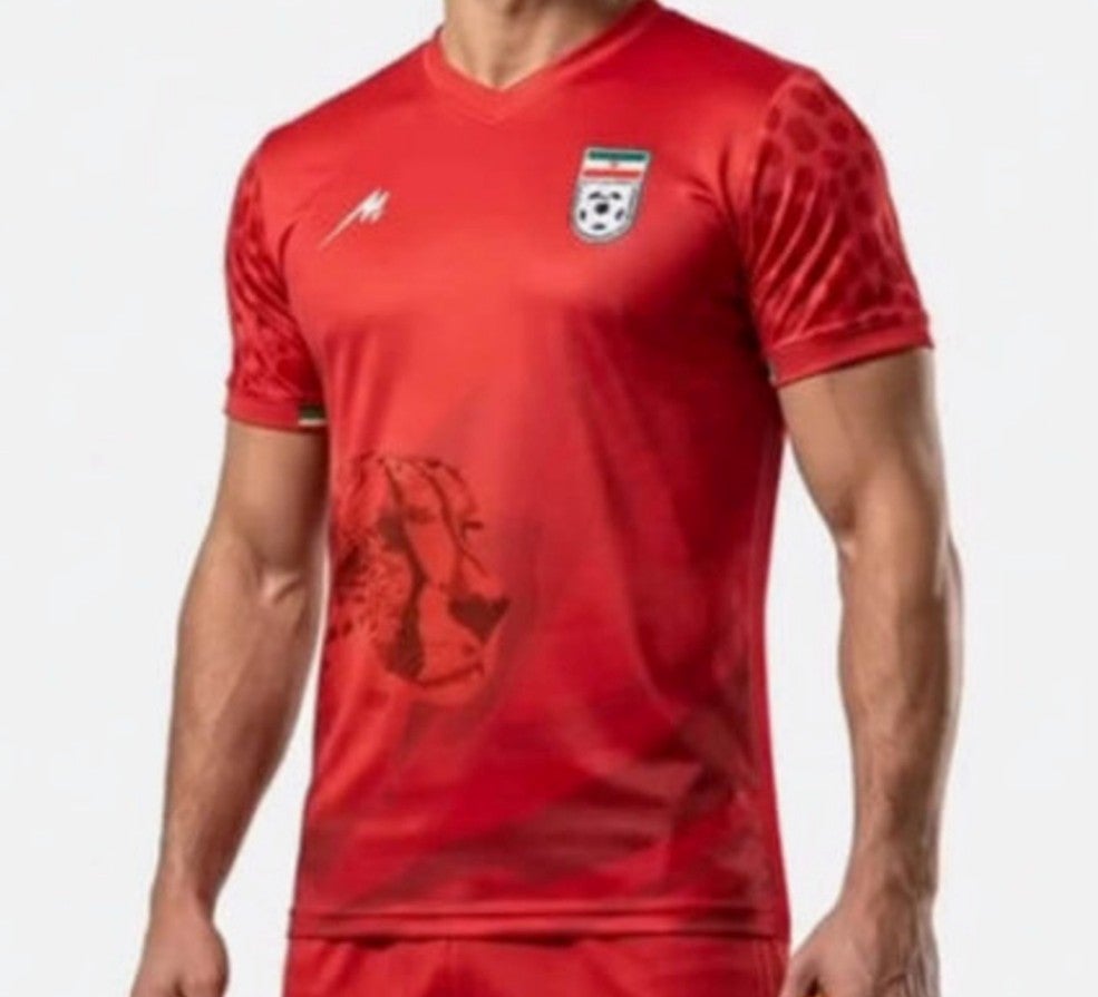
64. Iran home: We would usually question the aesthetic benefit of printing the ghost of a big cat’s face on a football shirt, but given it is there to raise awareness of the plight of the Asiatic cheetah, we approve. The sleeve print is a nice touch, too.
 open image in gallery
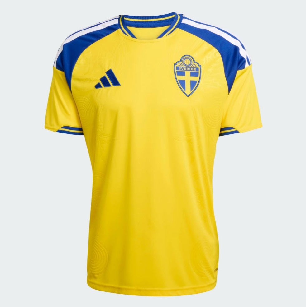
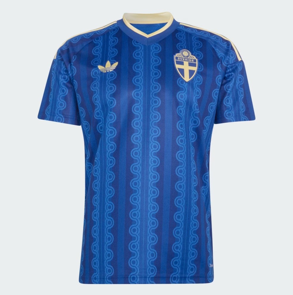
63. Sweden home: A touch boring, maybe, but broadly acceptable.
 open image in gallery
62. Turkey away: A bit better than the home shirt.
 open image in gallery
61. Argentina home: It looks great from a distance. But look closely and the faded, blocky stripes are a little ugly.
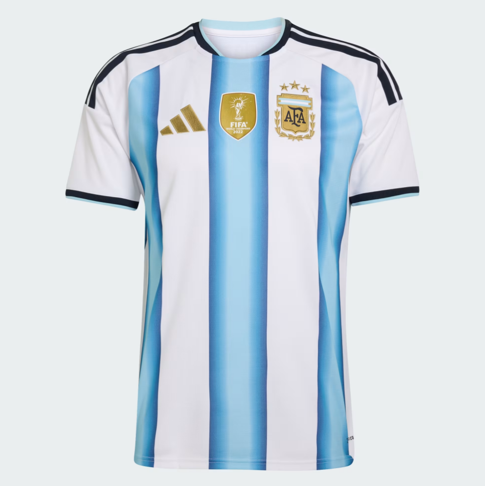 open image in gallery
60. Egypt away: We’ve just noticed Puma are putting Pumas on all of their shirt shoulders and we can’t stop noticing it now.
 open image in gallery
59. Iran away: Much the same as the home edition, but better.
 open image in gallery
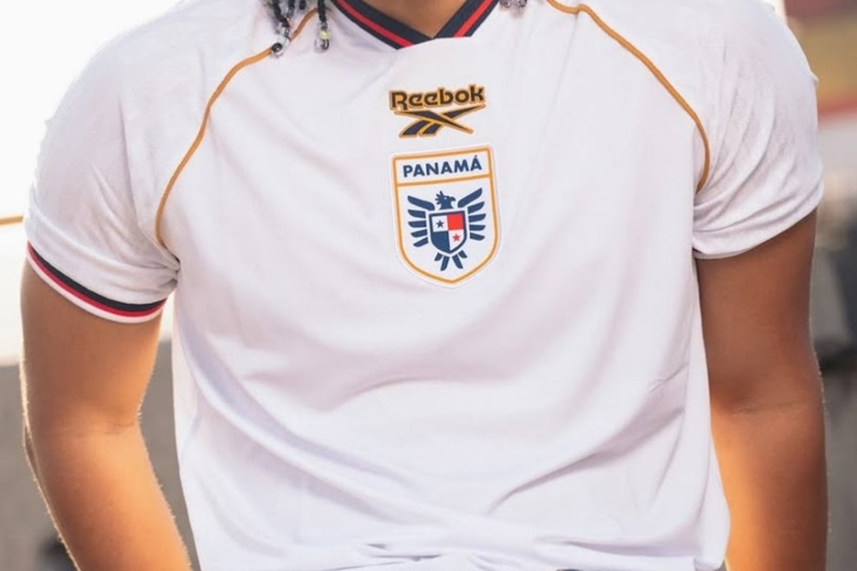
58. Panama away: Panama’s third shirt is absolutely lovely – Scotland Euro 96 vibes – but we are only allowing home and away kits into these rankings or we’d not have time to see our family, and unfortunately the away shirt is a little underwhelming.
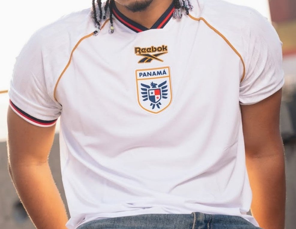 open image in gallery
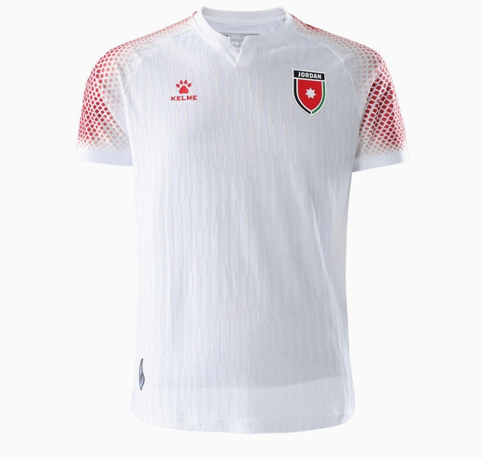
57. Jordan home: This is a bit better from Kelme, upping their game with a fun shoulder pattern and some subtle striping down the body.
 open image in gallery
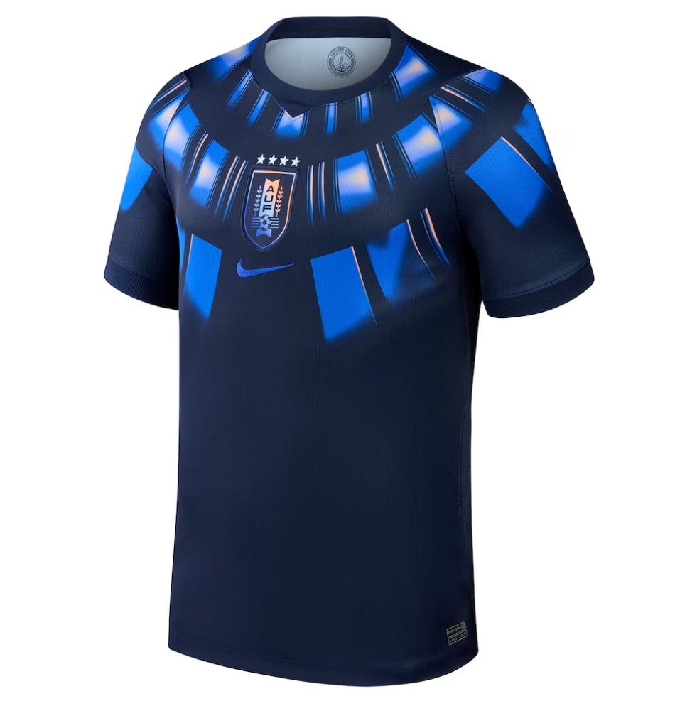
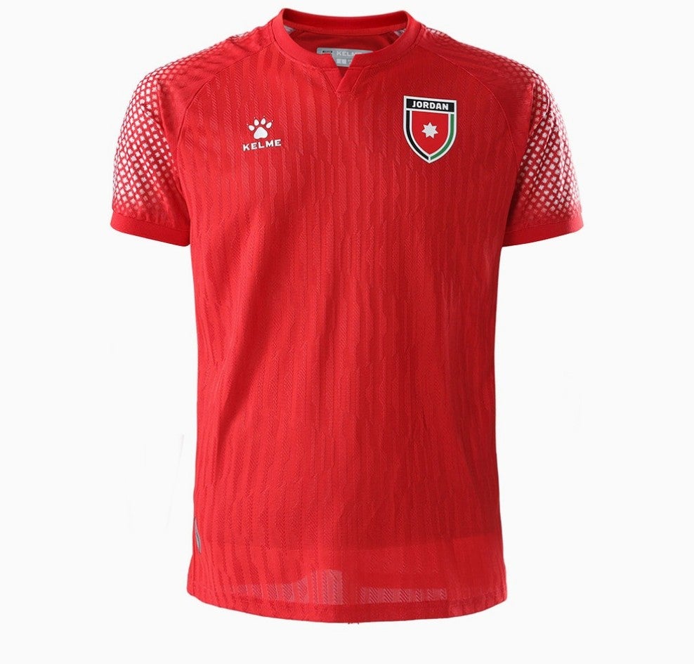
56. Jordan away: Much the same but in reverse.
 open image in gallery
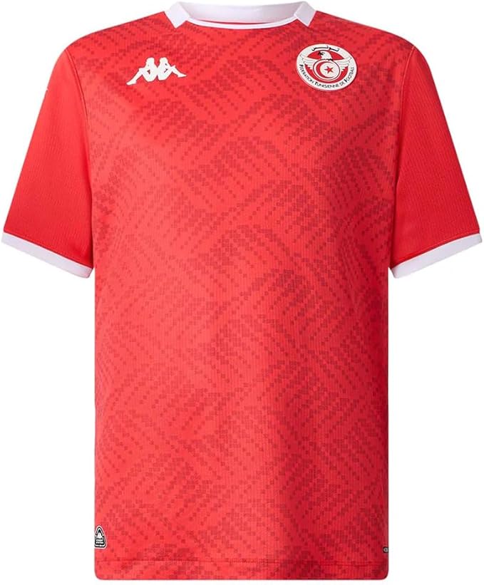
55. Tunisia home: Kappa, welcome! This one is absolutely OK.
 open image in gallery
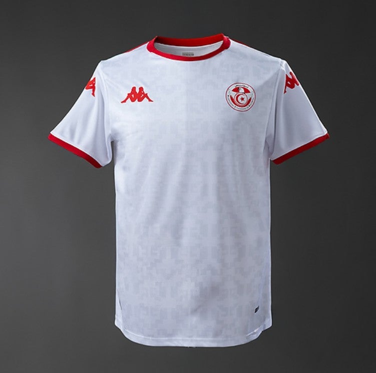
54. Tunisia away: Likewise. Thanks, Kappa.
 open image in gallery
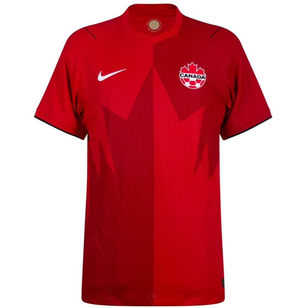
53. Canada home: The maple leaf motif is a little gimmicky, but we’re feeling generous.
 open image in gallery
52. Cape Verde home: Jazzy.
 open image in gallery
51. Croatia away: This one works slightly better than the home shirt but we’re still thinking about it.
 open image in gallery
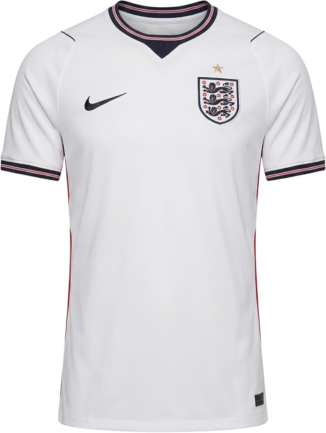
50. England home: Sharp trim, fine lines, classic colours. A solid effort.
 open image in gallery
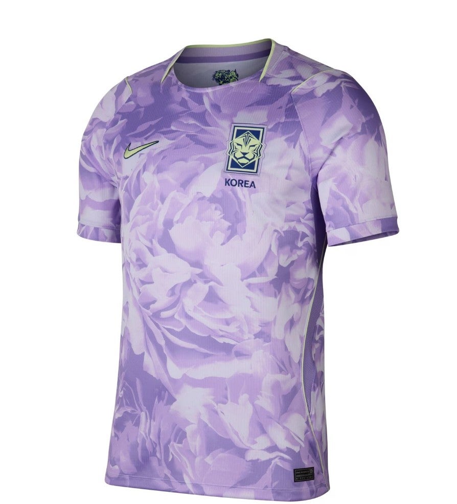
49. South Korea away: Korea’s purple flowers are a big room-splitter, and we’ve toyed with putting this shirt at the very bottom of our rankings. But no, it’s daring and original, and Korea already have one shirt down there, so we’re giving this one The Independent’s official stamp of mediocrity.
 open image in gallery
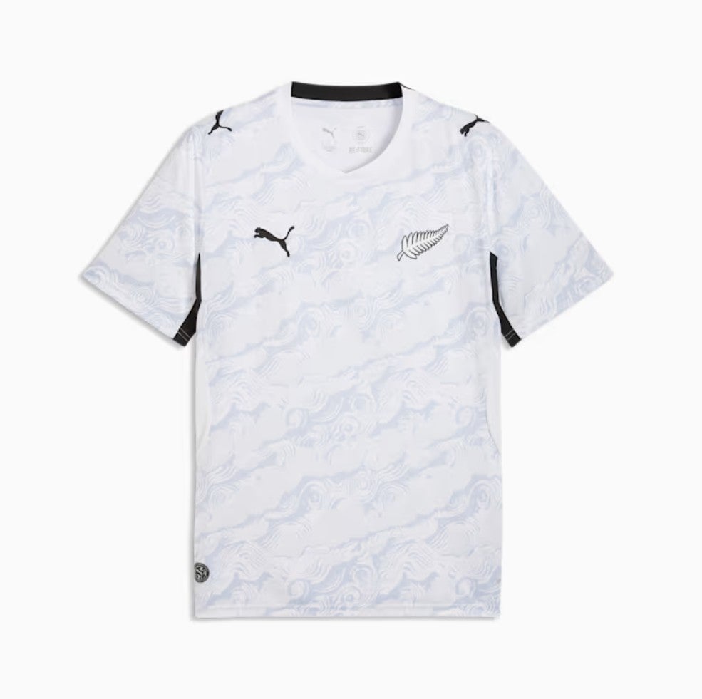
48. New Zealand away: That background pattern symbolises “the four winds that bring the country together”, say Puma. We don’t mind it, and we like the white sleeves and collar which gives this kit a clean look. Though if we’re being picky, which we are, the black Puma and white fern are slightly jarring together.
 open image in gallery
47. Algeria away: The red trim elevates this shirt with some smart detail.
 open image in gallery
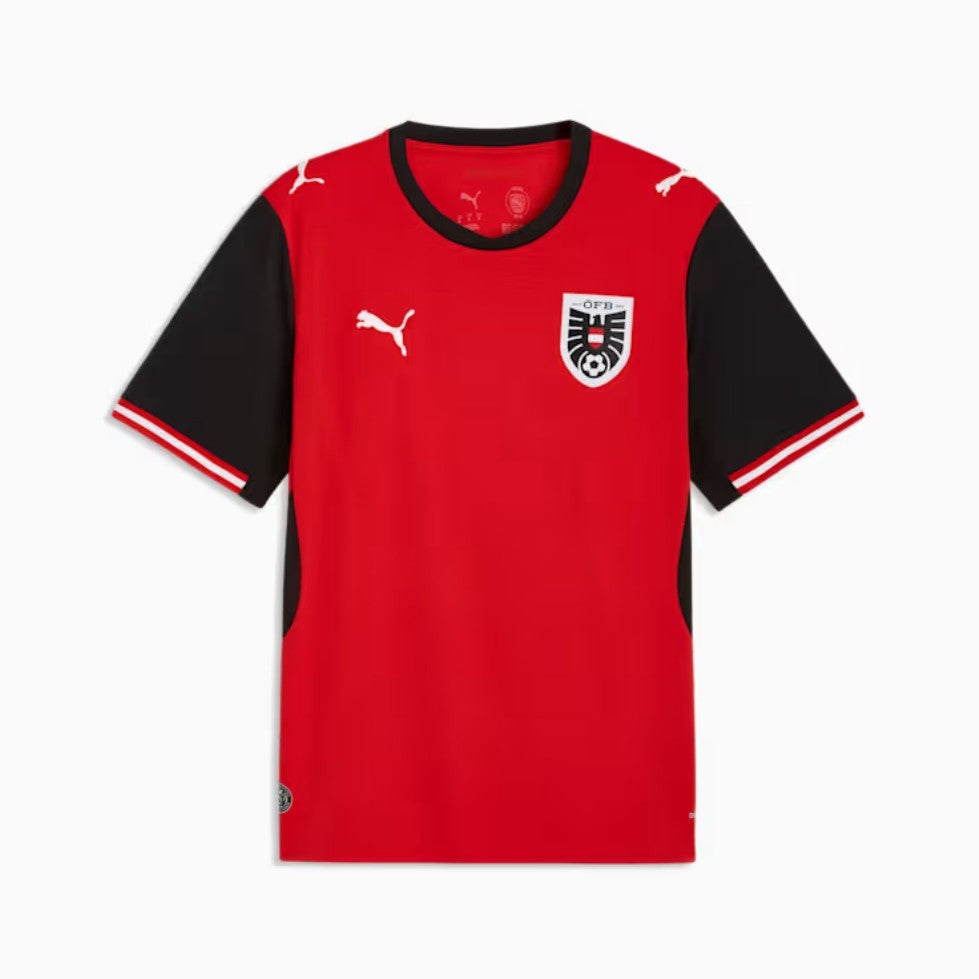
46. Austria home: Good solid colours, bold blocks, hard lines. Very Austrian.
 open image in gallery
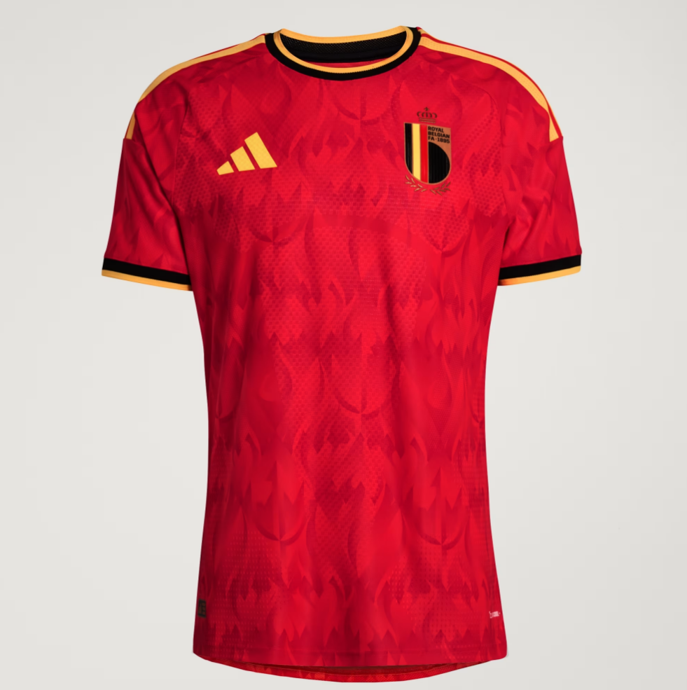
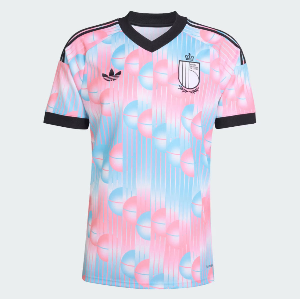
45. Belgium home: Feels like classic Belgian fare, and we’re happy with it.
 open image in gallery
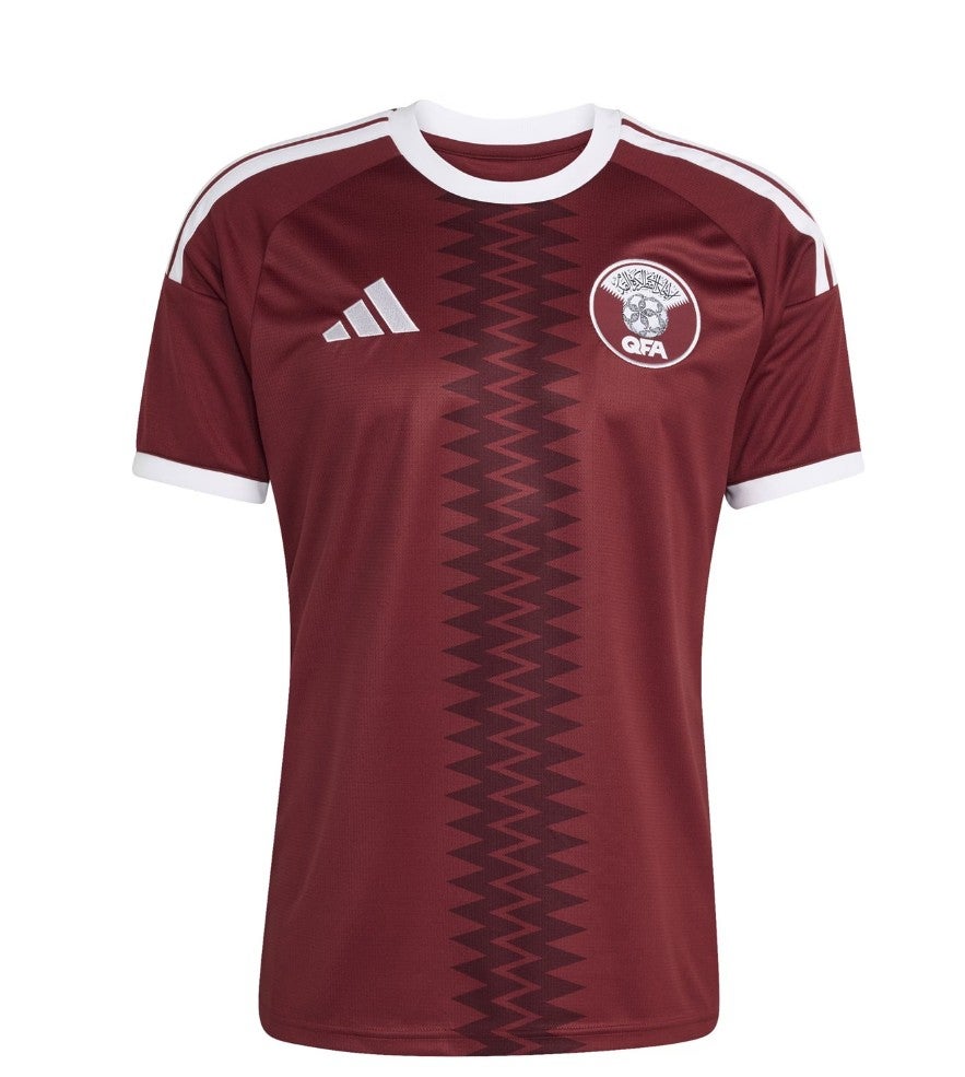
44. Qatar home: Funky pattern. Don’t mind it.
 open image in gallery
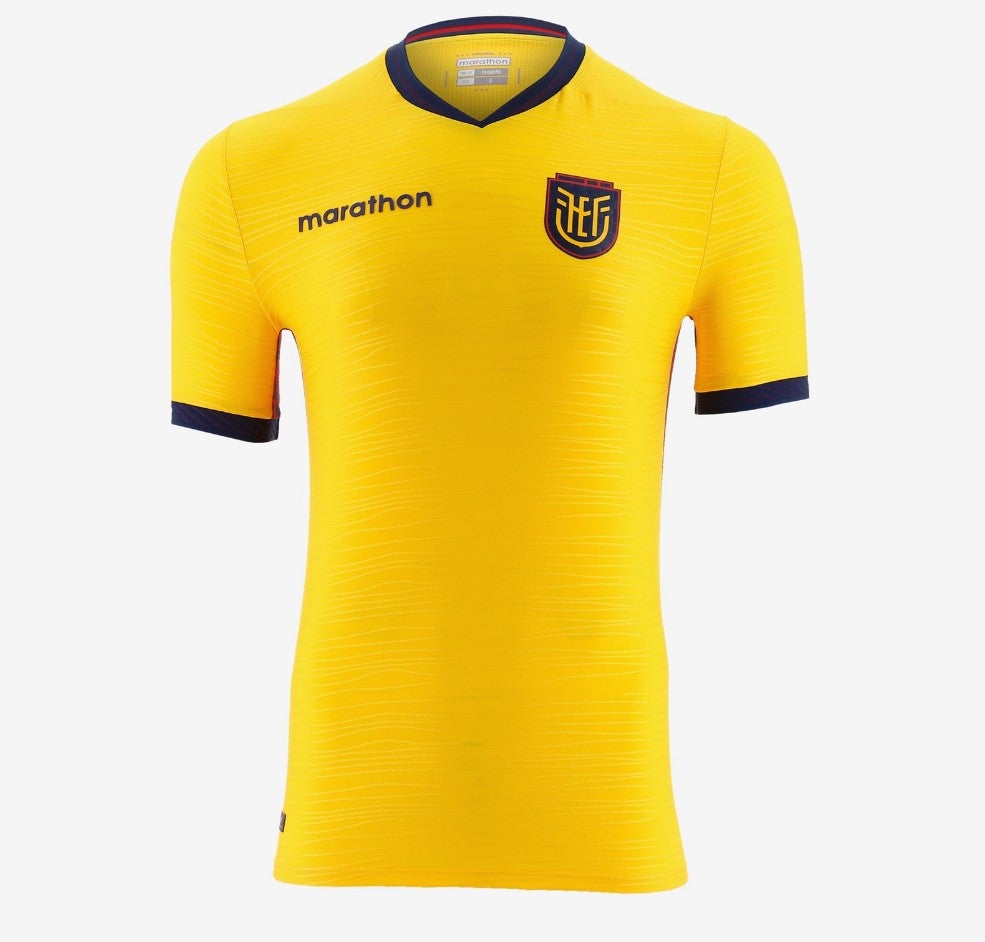
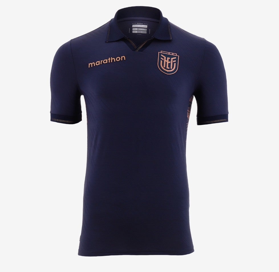
43. Ecuador home: Perfectly nice. We move on.
 open image in gallery
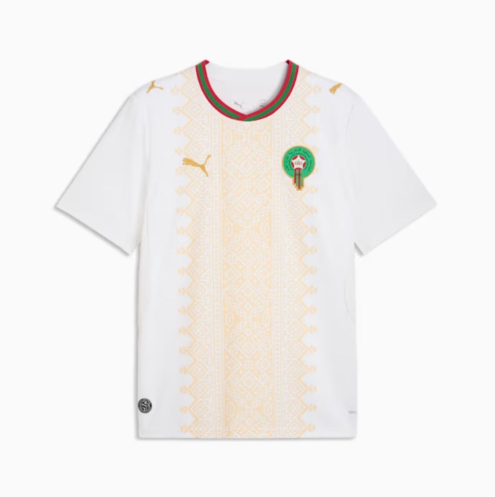
42. Morocco away: We love the background pattern here. The sleeves just need a little something.
 open image in gallery
41. Czechia home: Absolutely fine, middle of the road, a solid football shirt. The button is a nice detail.
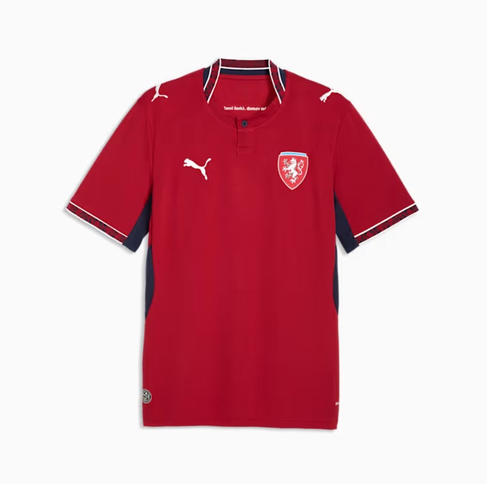 open image in gallery
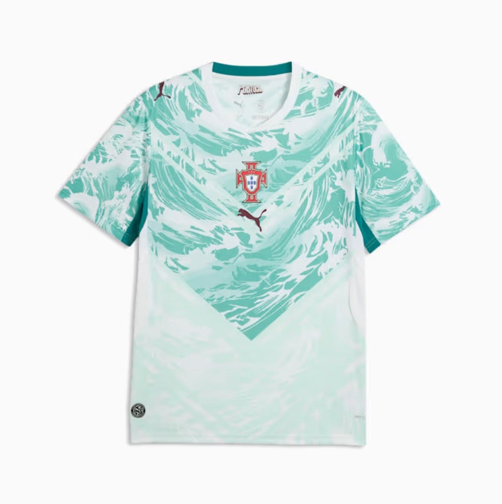
40. Portugal home: Wavy. Uncomplicated.
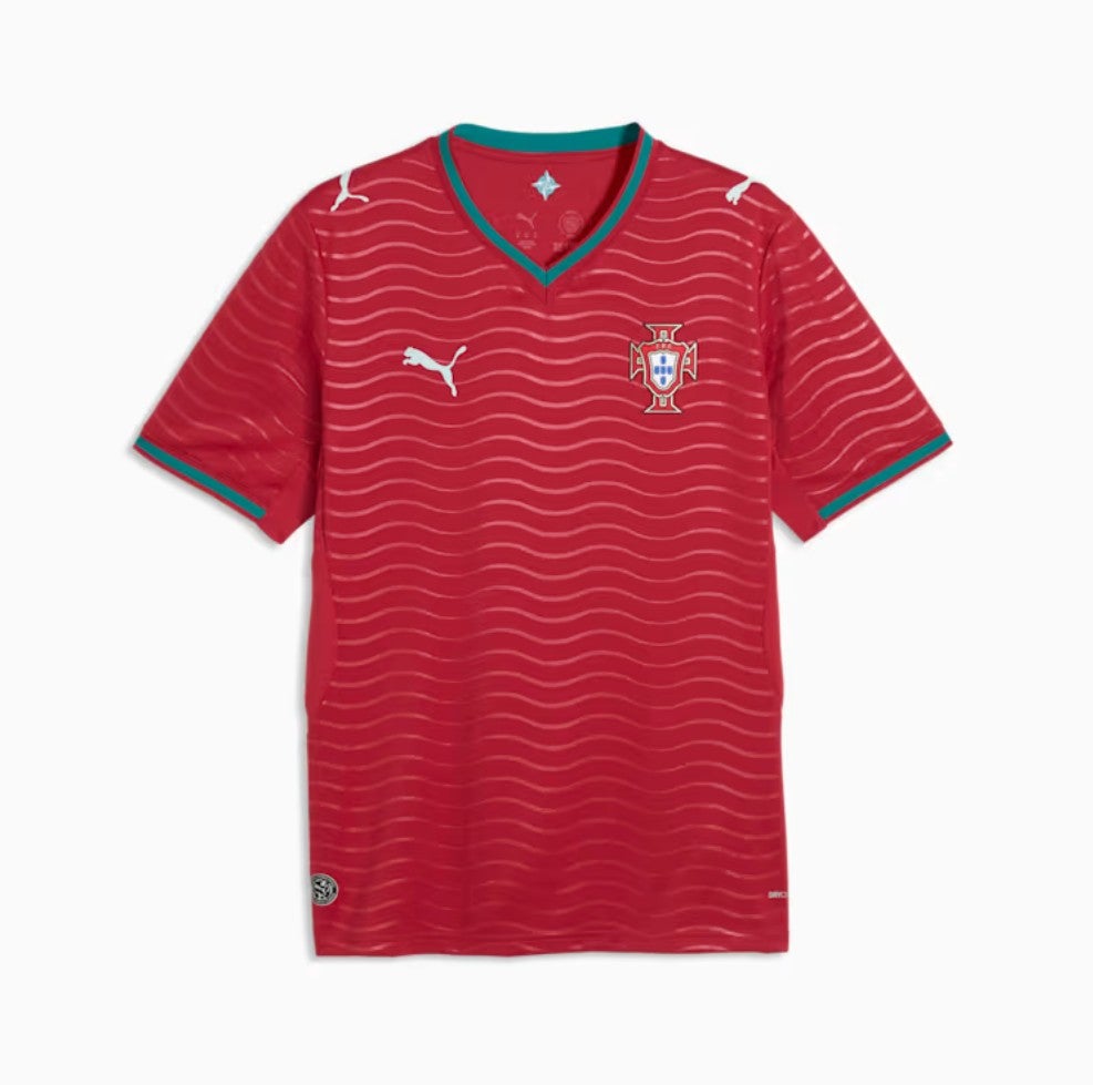 open image in gallery
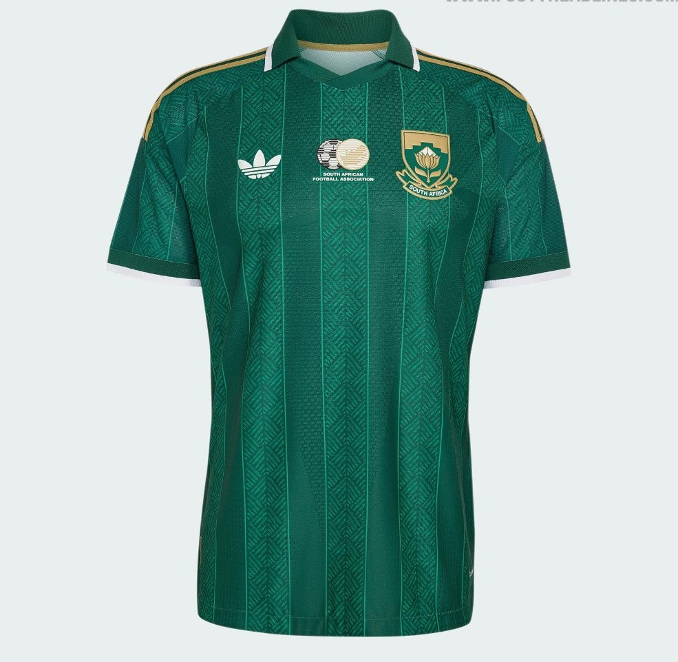
39. South Africa home: Yep, smart pattern here, good colours, distinctly South African feel.
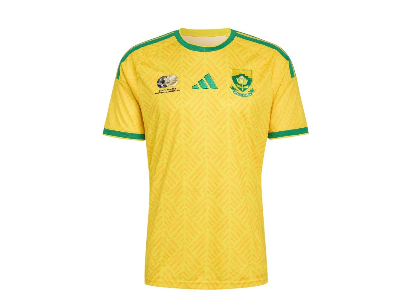 open image in gallery
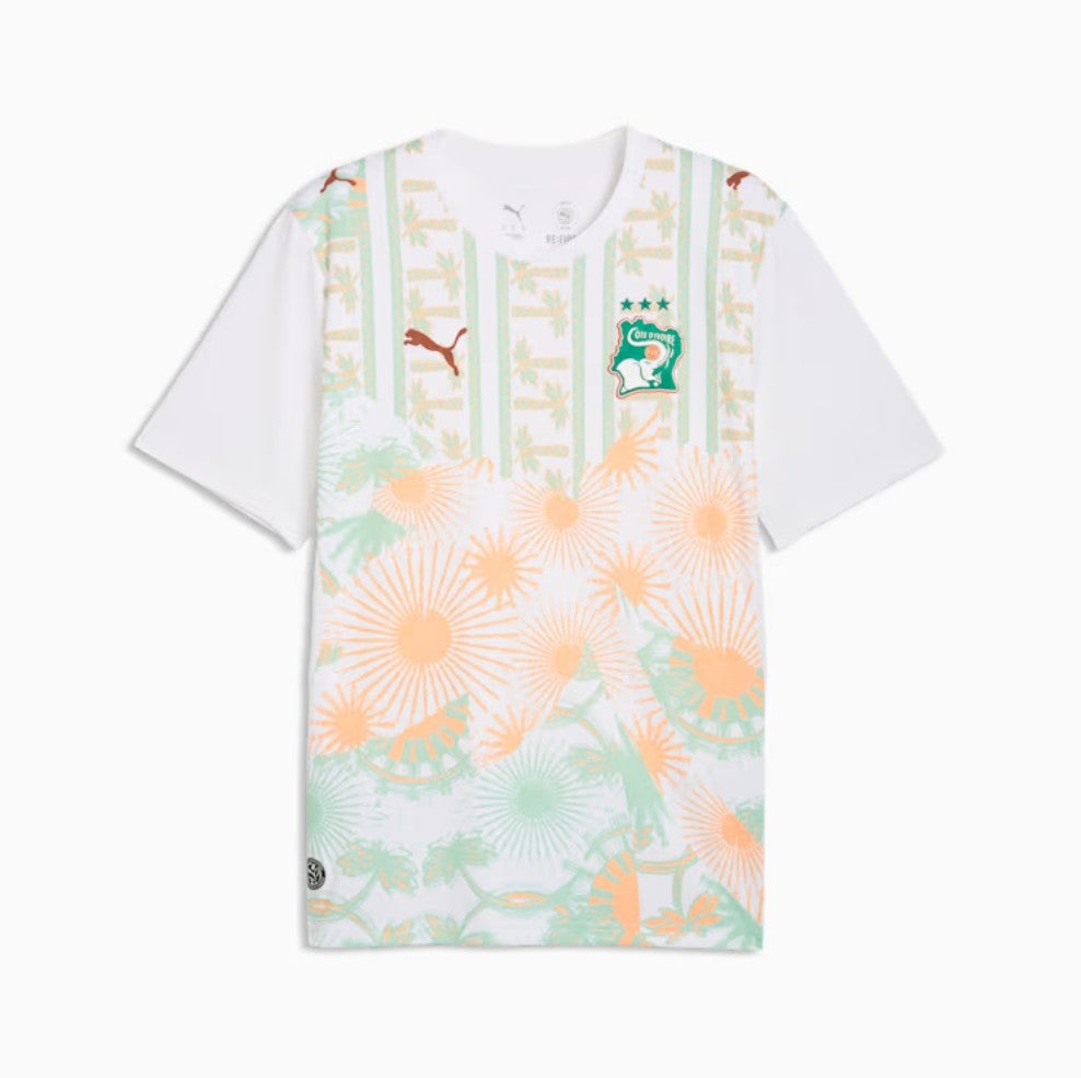
38. Ivory Coast home: Orange, in a good way.
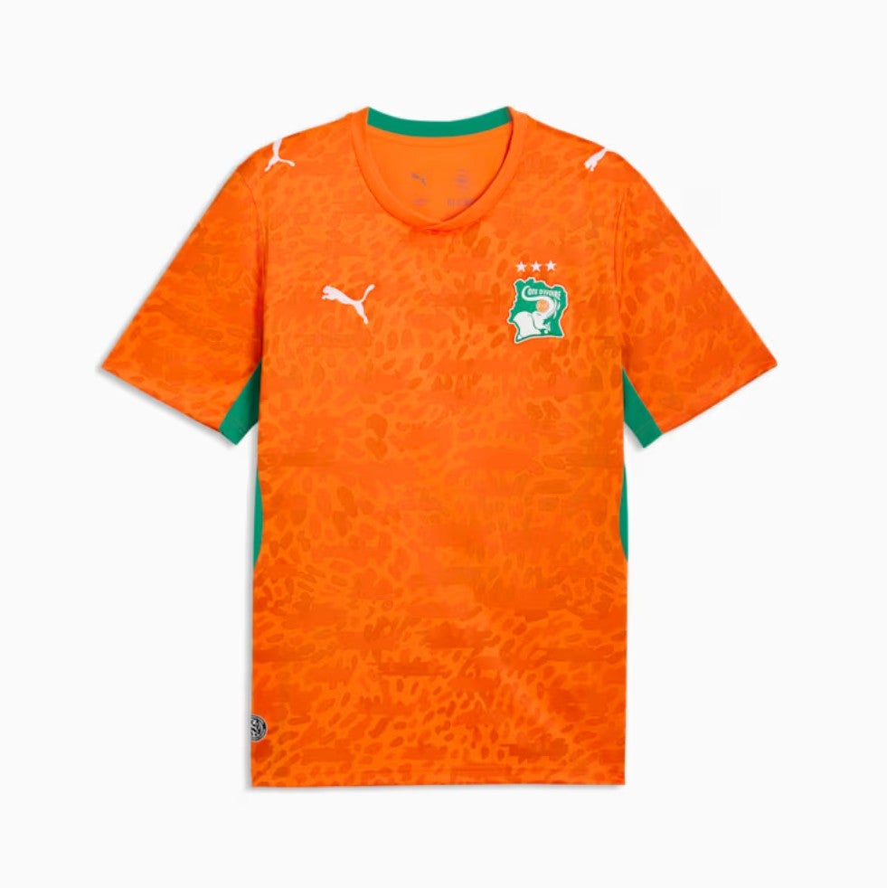 open image in gallery
37. Czechia away: It’s quite bold to dabble with gold when you’re anyone other than Brazil or Germany, basically – deep World Cup heritage. But fair play to Czechia, who’ve gone for it anyway, lifting what is otherwise a pleasant shirt.
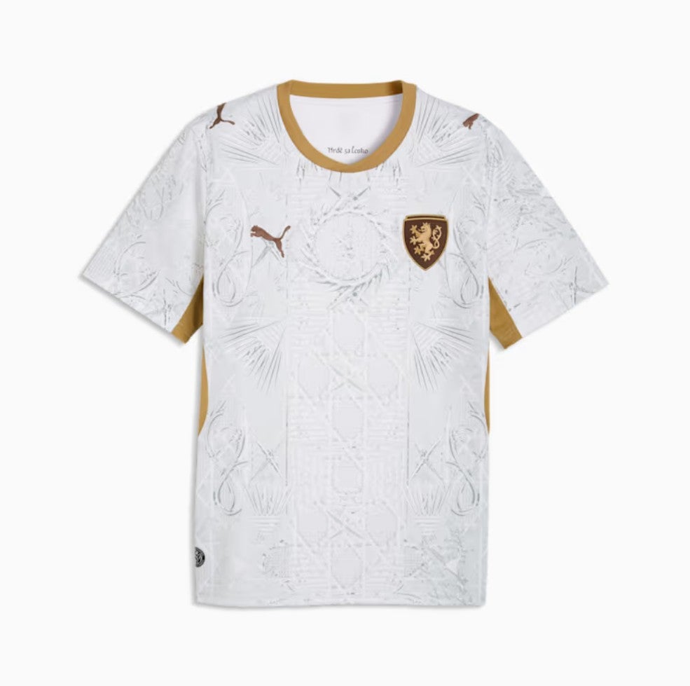 open image in gallery
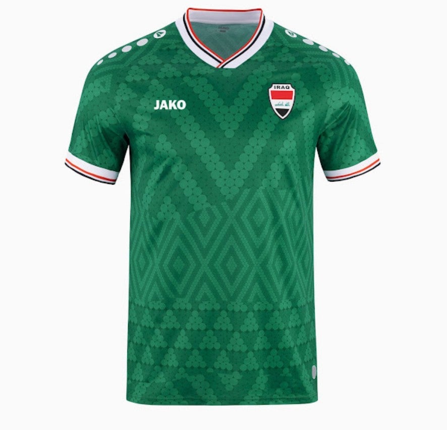
36. Iraq home: The good people at Jako tend to pull out the odd banger and the away version of this shirt is particularly eye-catching. But we like the design on the home shirt too.
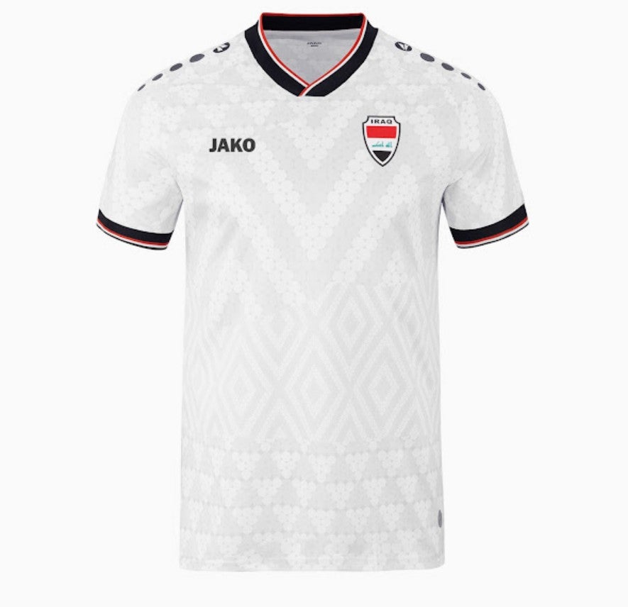 open image in gallery
35. Germany away: The three little diamonds make for a neat pattern and the colours are sharp. It’s a lovely aesthetic.
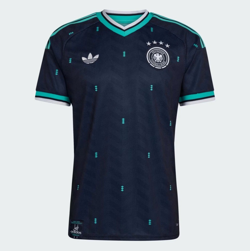 open image in gallery
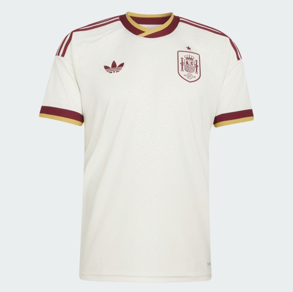
34. Spain home: This shirt doesn’t say a lot in isolation, but the sleeves tie in nicely with the shorts and there’s a yellow strip on the shoulders which we also enjoy. Perhaps not one of Spain’s great World Cup shirts but a good effort.
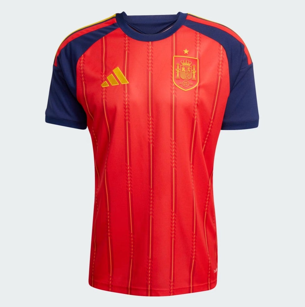 open image in gallery
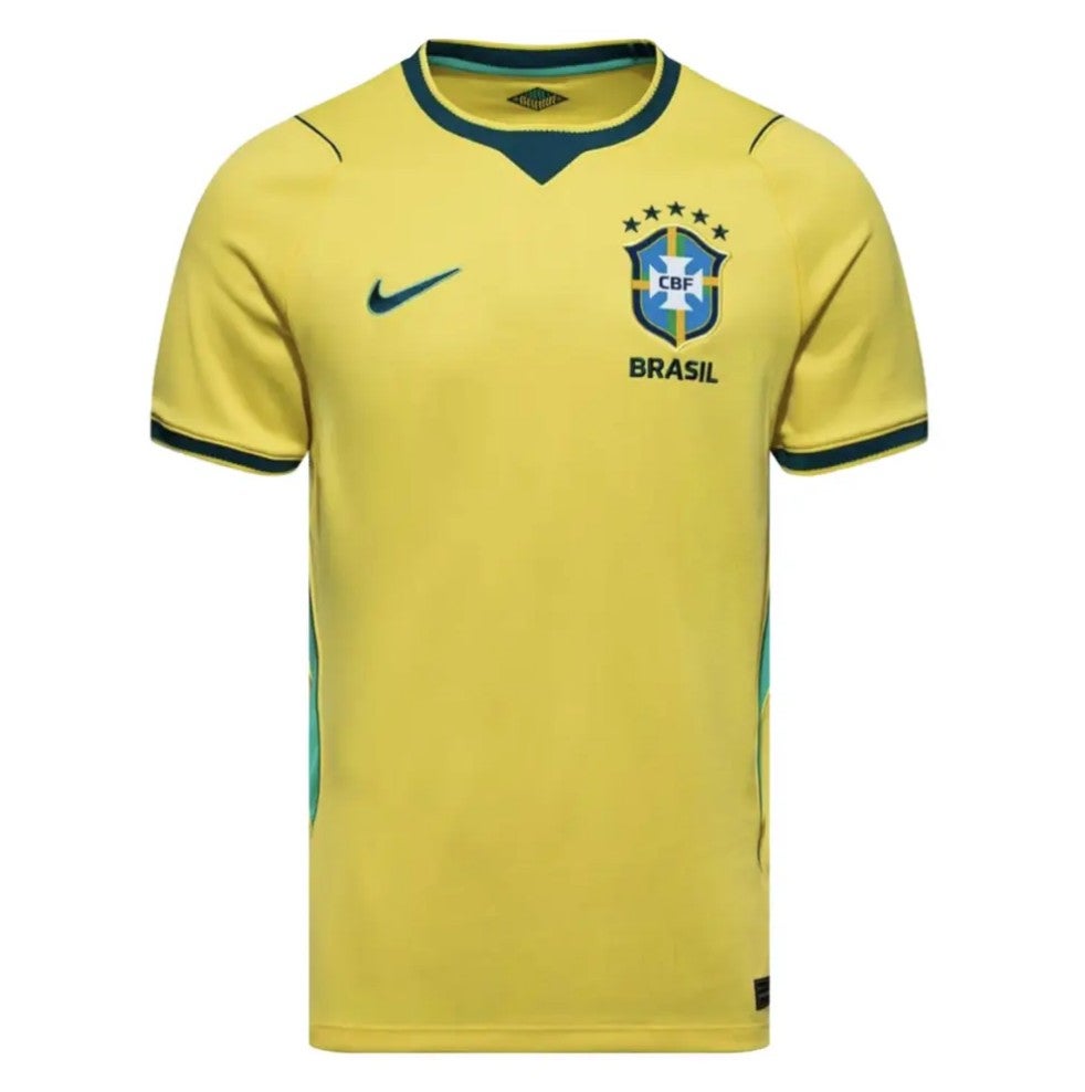
33. Brazil home: Sometimes a simple, classic design works best, especially for nations with aura embedded in the crest. There are shades of 2002 here in the green trim down the sides and around the neck line.
 open image in gallery
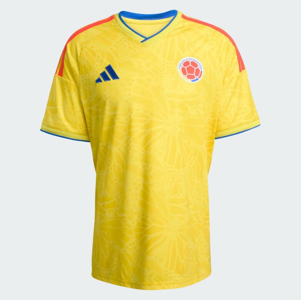
32. Colombia home: Inspired by magical realism, says Adidas, whatever that is. But we like this shirt: good solid Colombian colours, a neat background pattern, a pleasant shoulder trim. Well done to all involved.
 open image in gallery
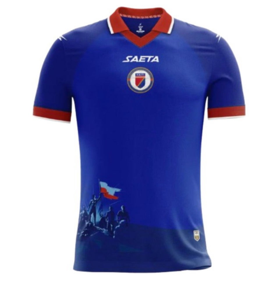
31. Haiti home: OK, nice little collar, bold blue body, a powerful scene depicting silhouettes of Haiti’s independence heroes triumphantly raising the national flag, smart red sleeve trim… Hold on, what?
Now, if basically any other country had done this it would be an abomination, but a quick Google tells us the Haitian Revolution is widely regarded as the only successful large-scale slave revolt in human history, creating the first Black republic in the world, so we say bravo.
 open image in gallery
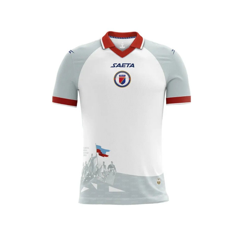
30. Haiti away: This one is even more pleasing than the home shirt, given the way the flag’s colours stand out.
 open image in gallery
29. Panama home: A nice colour, a nice collar. Nice.
 open image in gallery
28. Portugal away: This could be quite Marmite but we’re feeling generous. Like the colour, like the waves, just about like the V.
 open image in gallery
27. Saudi Arabia away: Almost all of the Adidas away kits are superb and this is another. It’s quite simple and yet really sharp and clean. We need to again call out the use of gold, which should be reserved for football royalty, but other than that it’s a lovely entrant.
 open image in gallery
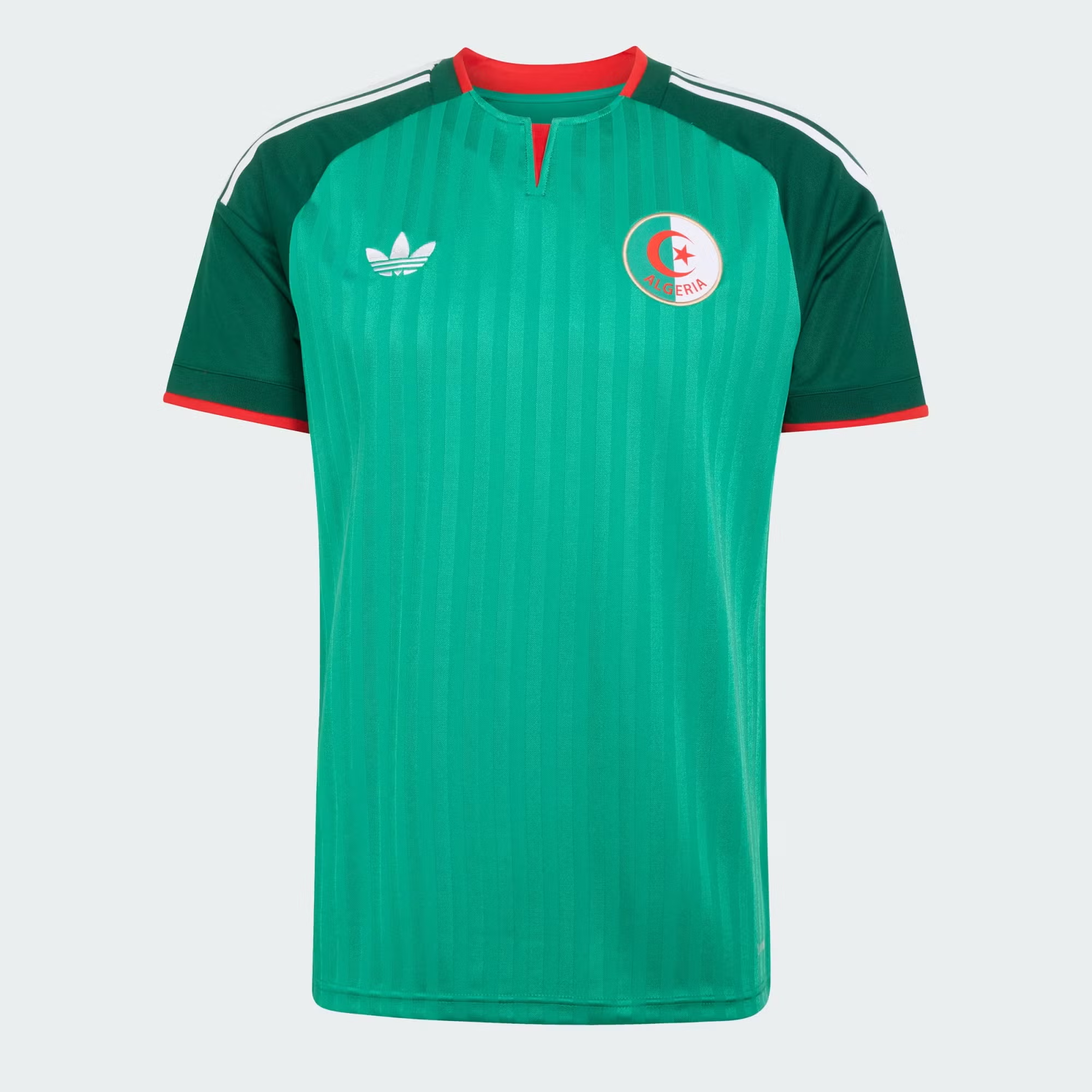
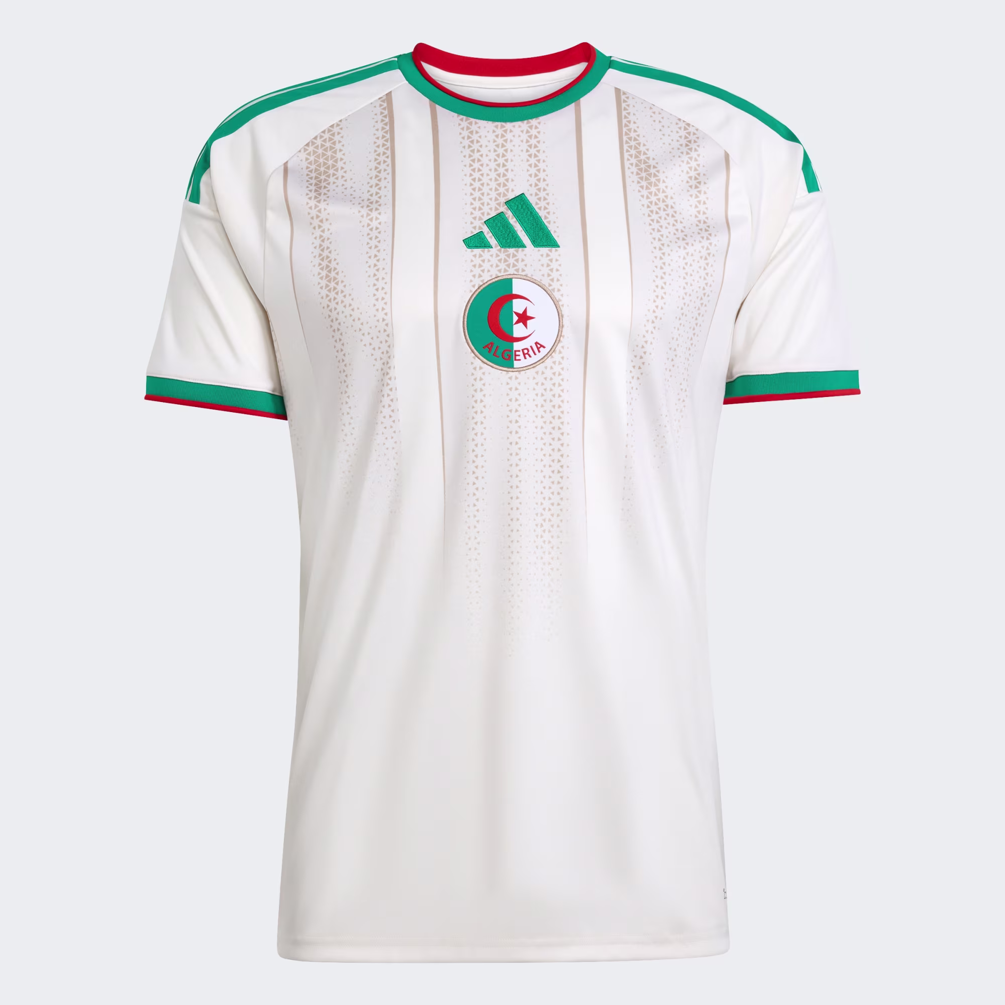
26. Algeria home: Creamy. The pattern is nice and subtle.
 open image in gallery
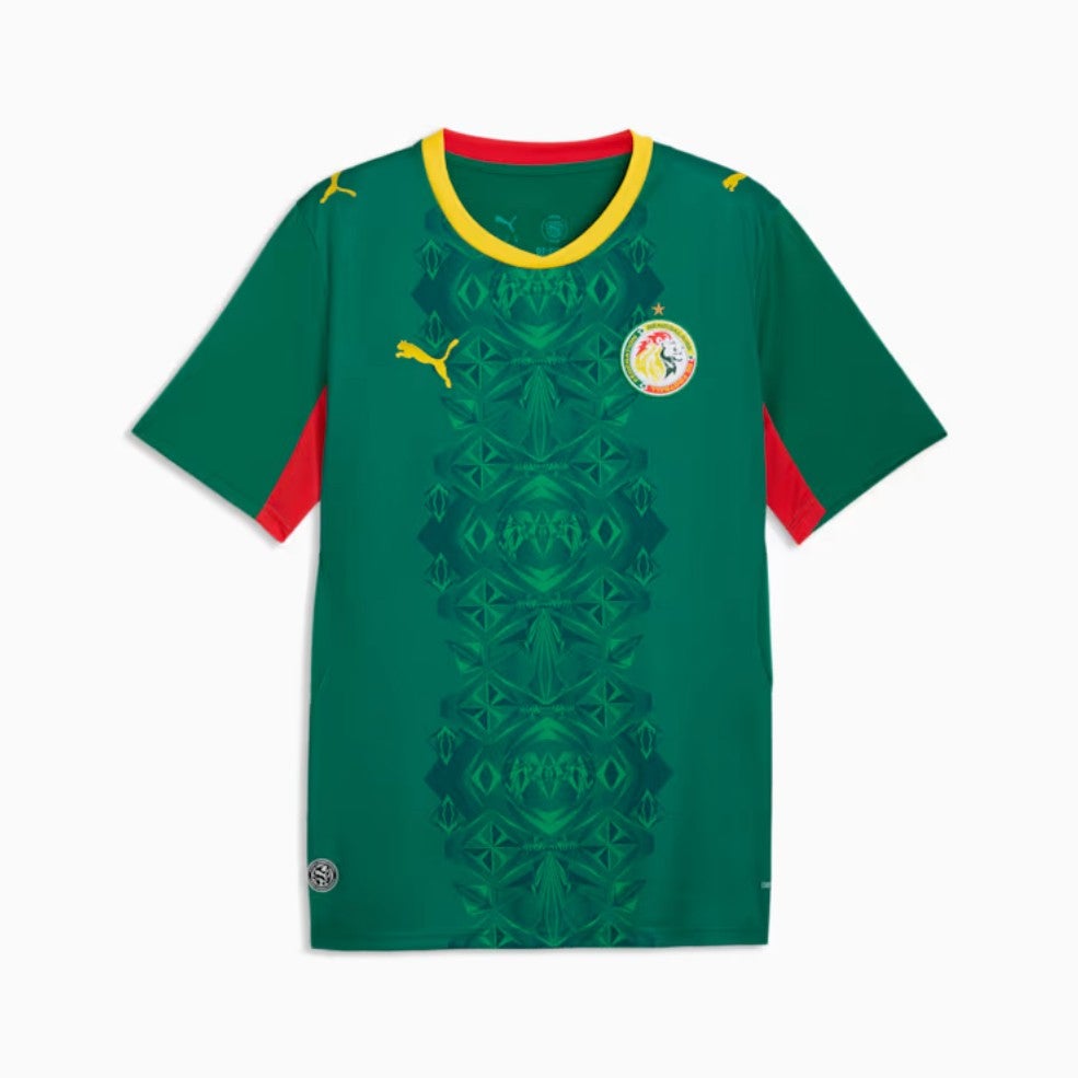
25. Ghana away: The pattern is based on Accra’s Makola Market, says Puma, and why not. A sunny shade, too. All together a pleasing edition.
 open image in gallery
24. Sweden away: We really like the design but the issue here is that it’s not very Swedish. It’s Brazilian, maybe, or Colombian, perhaps. Even so, it’s a lovely thing.
 open image in gallery
23. Ivory Coast away: This was briefly in the ‘terrible’ pile but we reconsidered and decided it is actually so bold and mad that it’s great. It’s in the ‘excellent’ pile and it’s not moving.
 open image in gallery
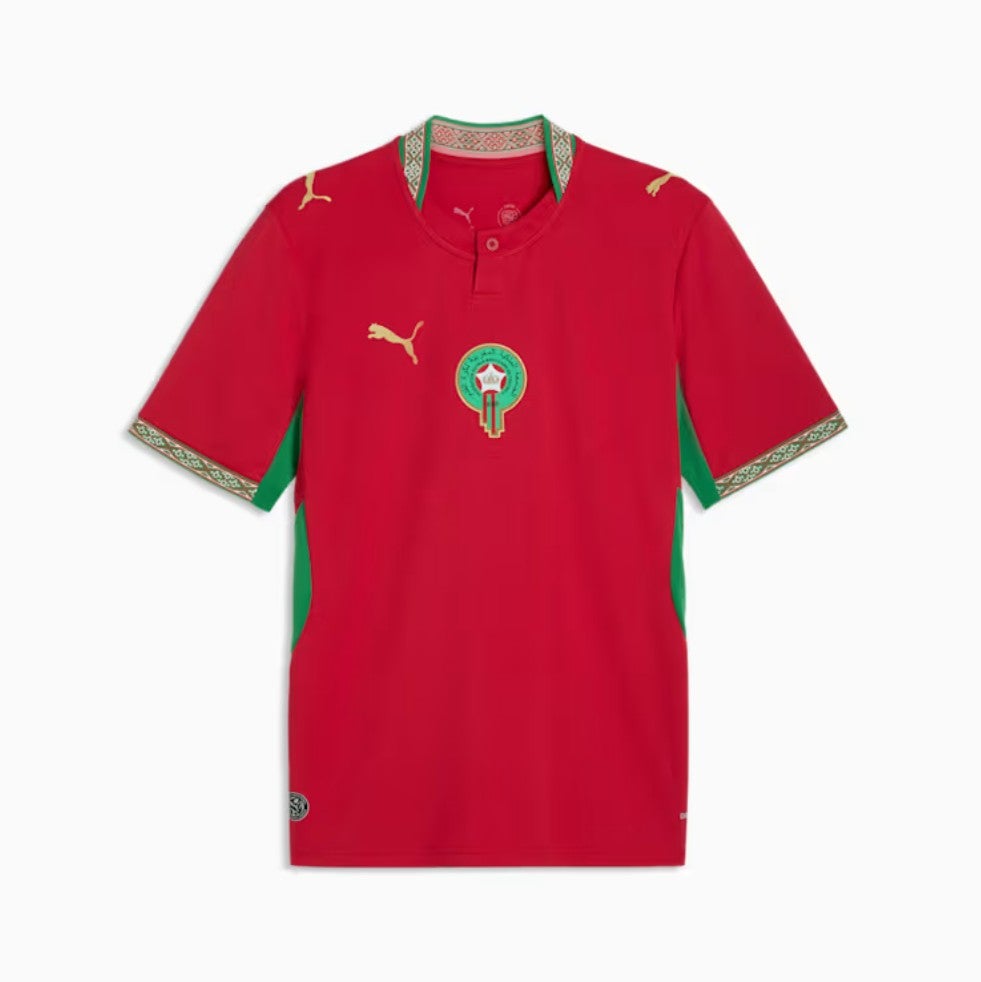
22. Morocco home: Collar of the tournament.
 open image in gallery
21. Senegal away: Yeah we like this a lot. Slightly running out of things to say about football shirts at this point if truth be told. If you’re still with us, thanks, great stamina. We’re on the home straight…
 open image in gallery
20. South Africa away: Another away belter from Adidas, although – and maybe this is just because we know it’s South Africa – we can’t stop thinking this is a Cricket World Cup shirt from some time in the 2010s. Still, there’s a lot to like here.
 open image in gallery
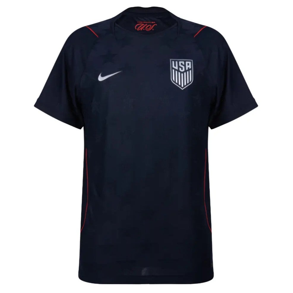
19. United States away: This is pretty great, with the faint black stars in the background and the thin red trim over the shoulders. Black shirts are almost always cool and this one is a doozy.
 open image in gallery
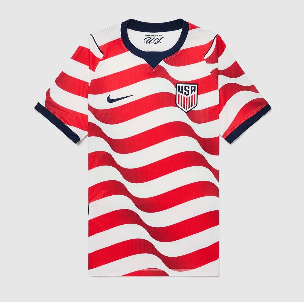
18. United States home: Setting aside the USA’s obsession with its flag, this is just objectively a great shirt. It is very American, which is important, it’s distinctive, it’s bright and it’s pretty to look at. Much better than some of the bland stuff they’ve worn before. Oh, and we just got it – two shirts, stars and stripes. Very good.
 open image in gallery
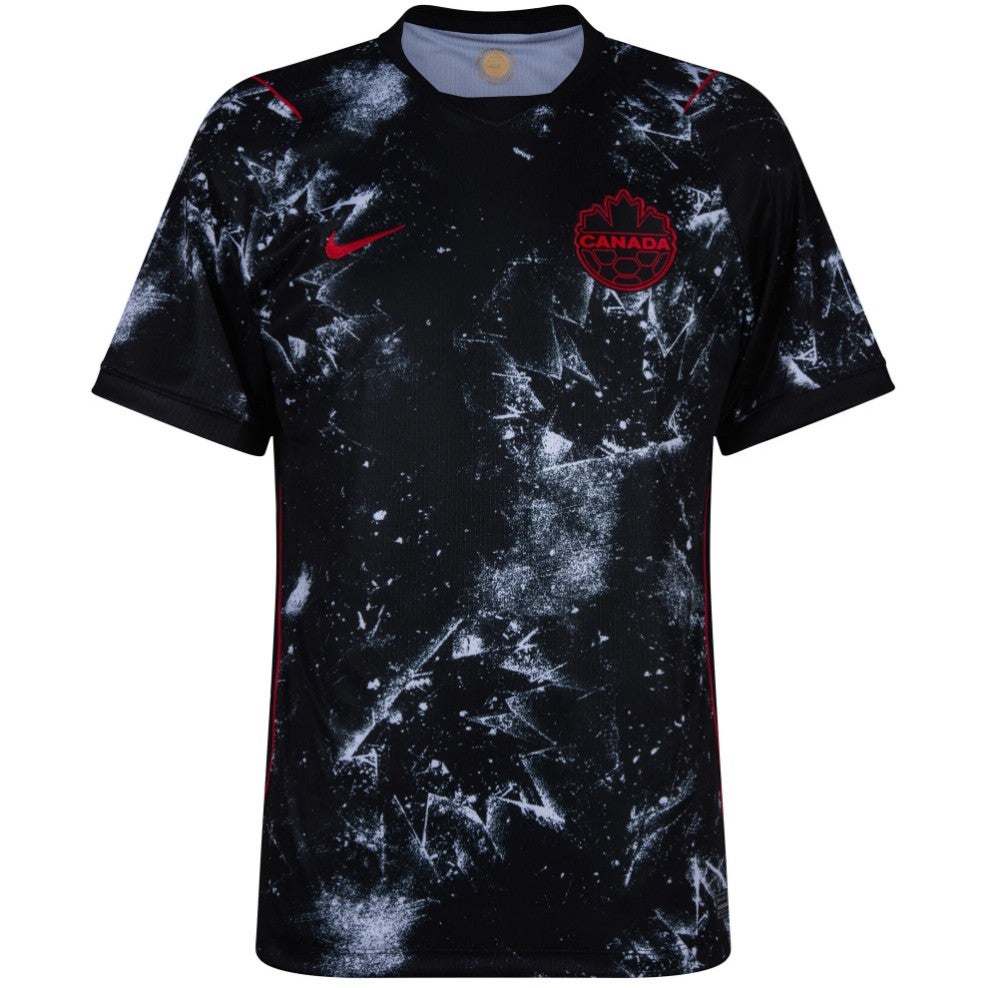
17. Canada away: Is it a constellation or a light dust of icing? Either way, this looks great.
 open image in gallery
16. DR Congo home: Umbro’s sole entrant to the World Cup is DR Congo, and it’s a belter. Is it blue fire? Is it the back of a large frog? We’re not sure.
 open image in gallery
15. Japan away: We love a pinstripe, as previous World Cup kit rankings will attest, and even though this one looks like it’s been done by a four-year-old with a box of crayons, we approve this effort by Japan.
 open image in gallery
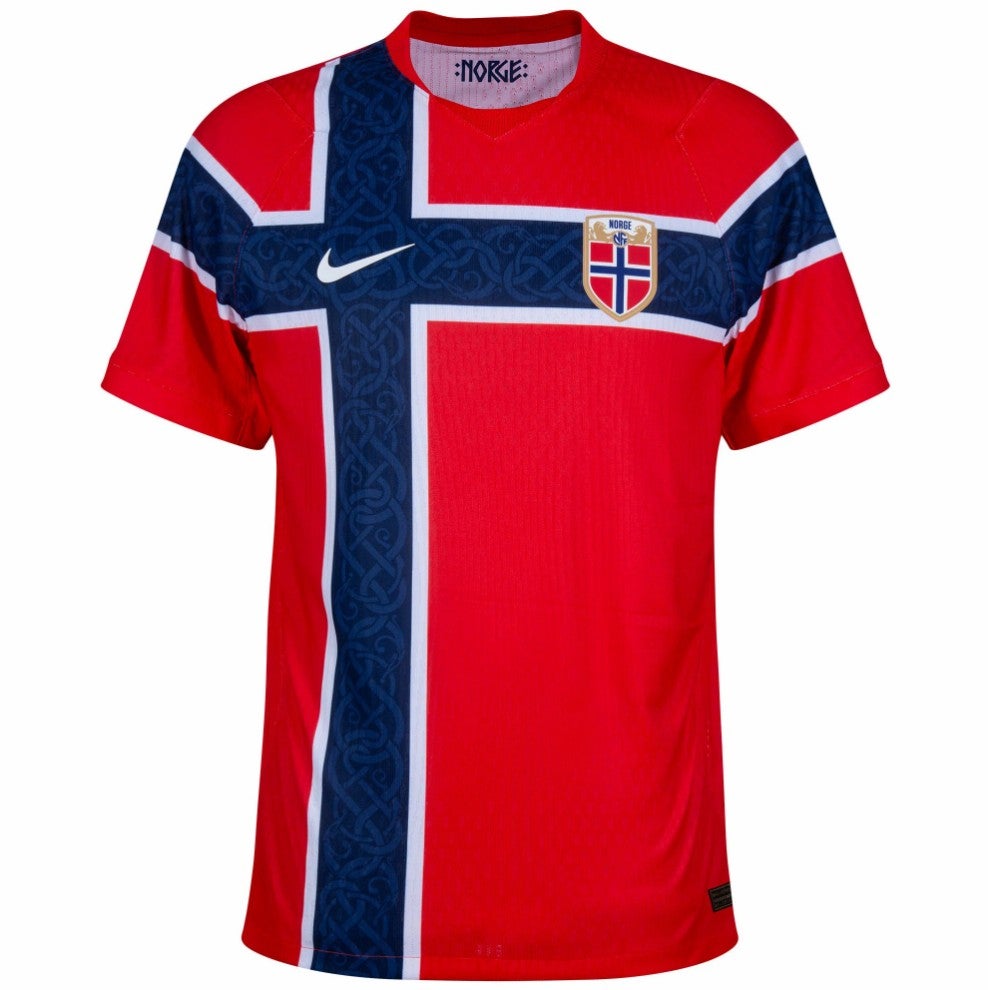
14. Norway home: We see what you’ve done here, Norway: you’re wearing a big flag. We like it, and Erling Haaland is going to look majestic in this thing. We’re not sure how far Norway will go in the World Cup but their shirt is a big plus! Cheers, all.
 open image in gallery
13. Scotland away: What a shade. Salmon, terracotta, coral? Whatever it is, we like it.
 open image in gallery
12. Ecuador away: Now, this we like this from the good people at Marathon. It’s a deep, moody shade of blue with a great collar, and Moises Caicedo will make some authoritative tackles in this thing.
 open image in gallery
11. Spain away: We really like this. It’s simple but neat and crisp, like a Xavi pass.
 open image in gallery
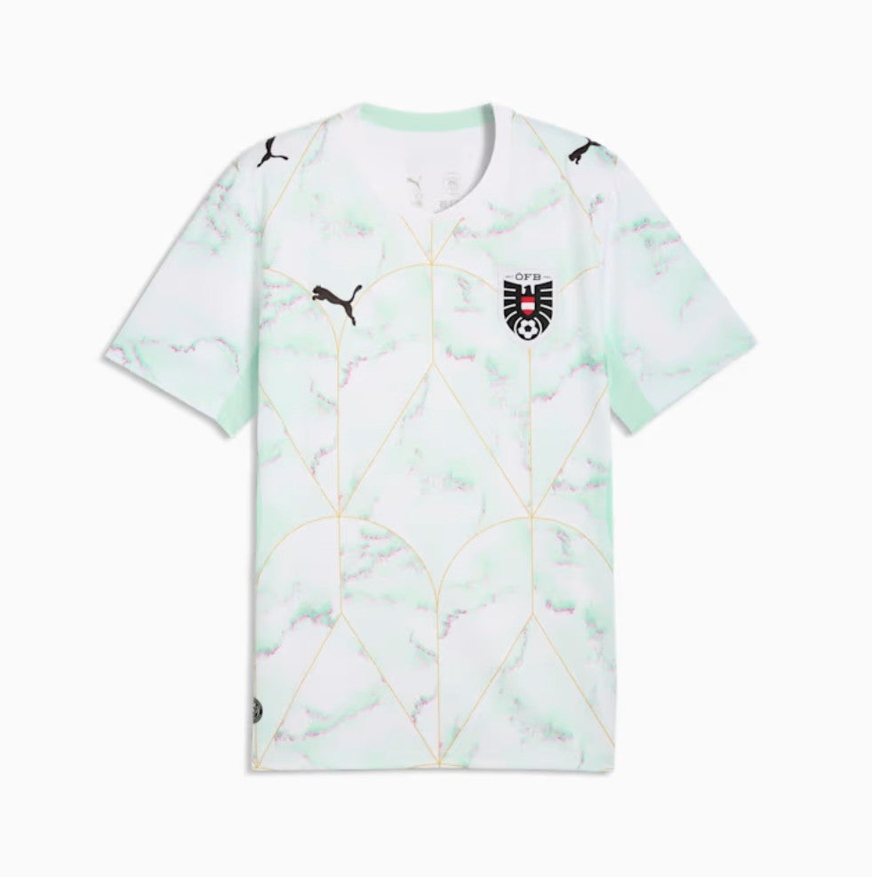
10. Austria away: One of Puma’s best this summer – the watercolour splodges work somehow, and we like the faint gold pattern on top. We called Czechia out for dabbling with gold and it is risky, but Austria have got away with it.
 open image in gallery
9. Iraq away: Here’s the Iraq away shirt we mentioned earlier, and it’s a cracker.
 open image in gallery
8. Uruguay home: A picture of elegance. The sort of shirt you want to wine and dine at a high-end restaurant on a first date. Darwin Nunez is going to look incredibly sharp hitting the post from a variety of ranges wearing this thing.
 open image in gallery
7. Belgium away: Inspired by Belgium’s surrealist movement, says Adidas. Garish, in a great way. It’s perilously close to being awful, but we love it.
 open image in gallery
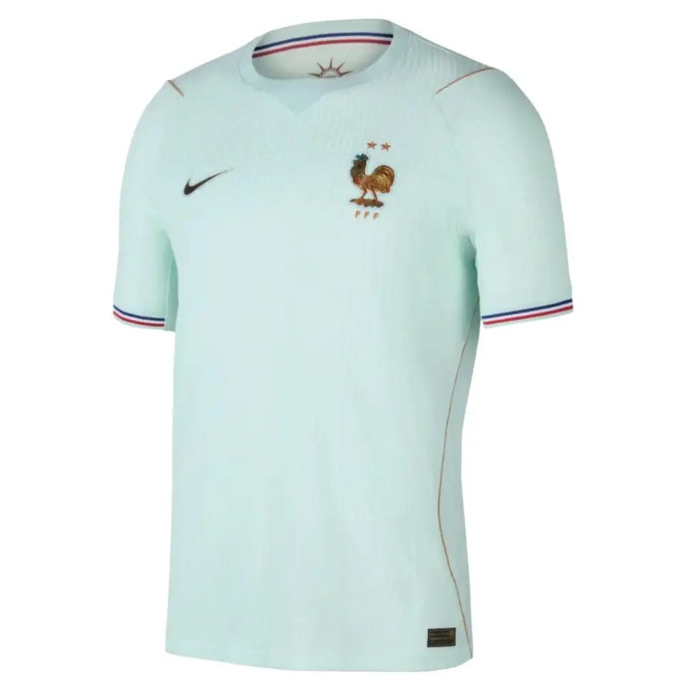
6. France away: Well this is lovely. The mint green, the subtle tricolour sleeve trim, the understated neckline. Overall it doesn’t feel very French (Portugal, away, maybe?) but it’s a very fine shirt.
 open image in gallery
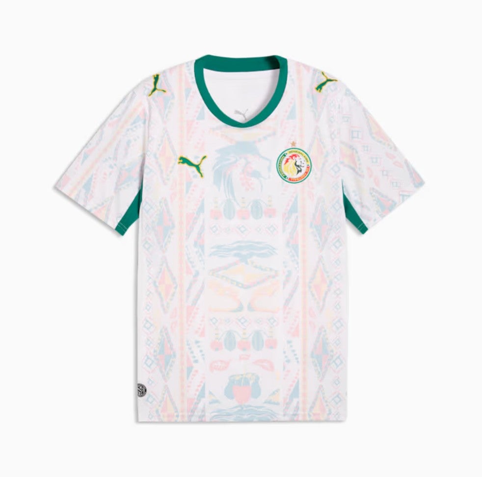
5. Senegal home: This could just be quite a nice T-shirt. But it makes a really great football shirt.
 open image in gallery
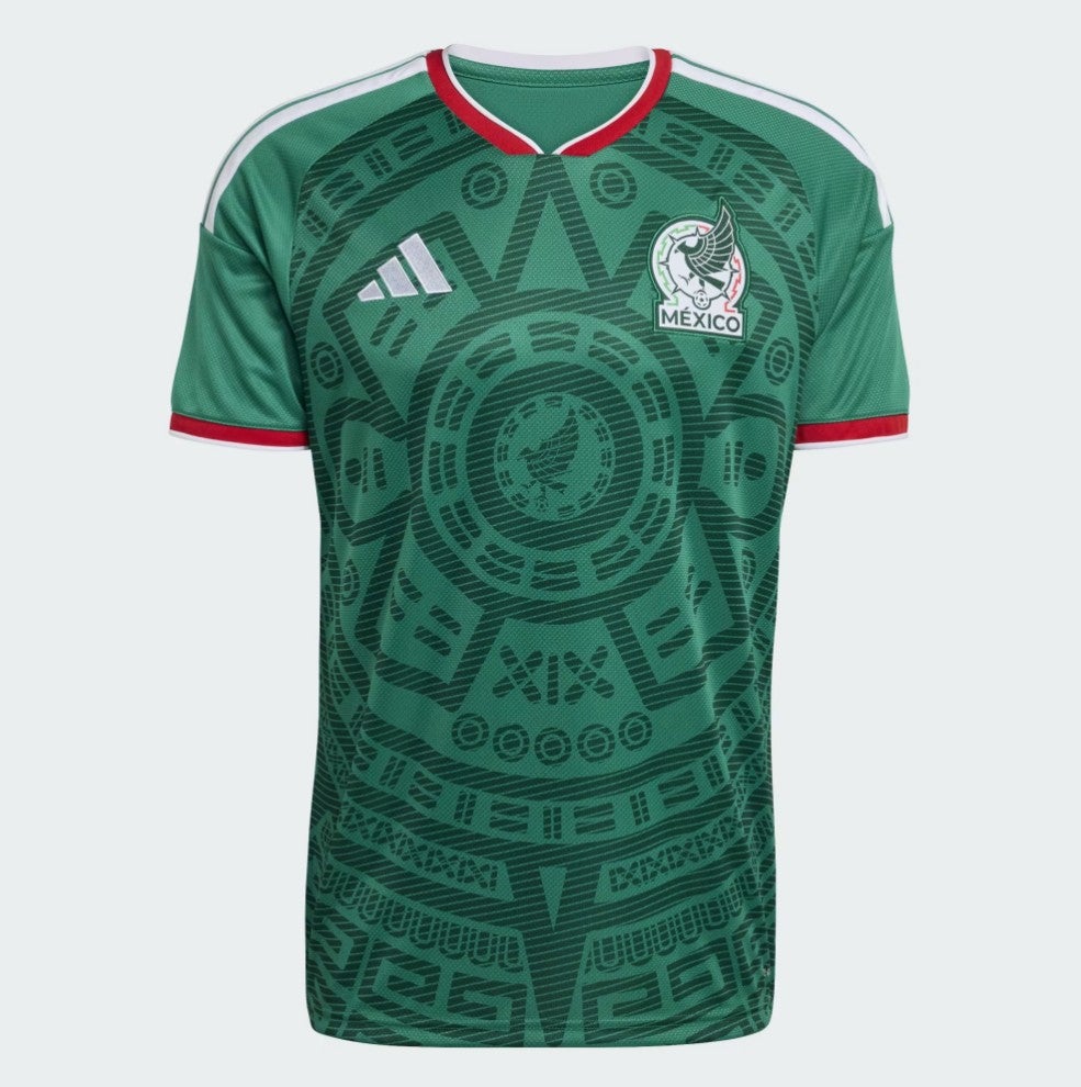
4. Mexico home: Mexico have topped our kit rankings in years gone by with an Aztec pattern similar to this one, and this summer’s home shirt is a very cool version on the same theme.
 open image in gallery
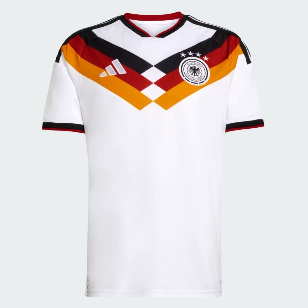
3. Germany home: We love a throwback and this has nostalgic shades of Italia 90 and USA 94, both elite Germany shirts, while standing on its own as a fine design. Hopefully Germany go far just so this shirt has its own bit of football legacy.
 open image in gallery
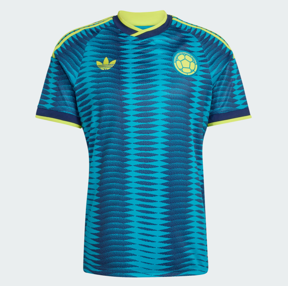
2. Colombia away: Yes, Colombia! This pattern has a distinct World Cup flavour with notes of summer, samba and South America. If the home shirt is the heart of Colombia, the away kit is a little slice of Caribbean coast. You could wear this to a summer barbecue and be the coolest person there. Though worth noting that if someone else was also wearing the same shirt at said barbecue, you’d both look a bit tragic. We don’t make the rules.
 open image in gallery
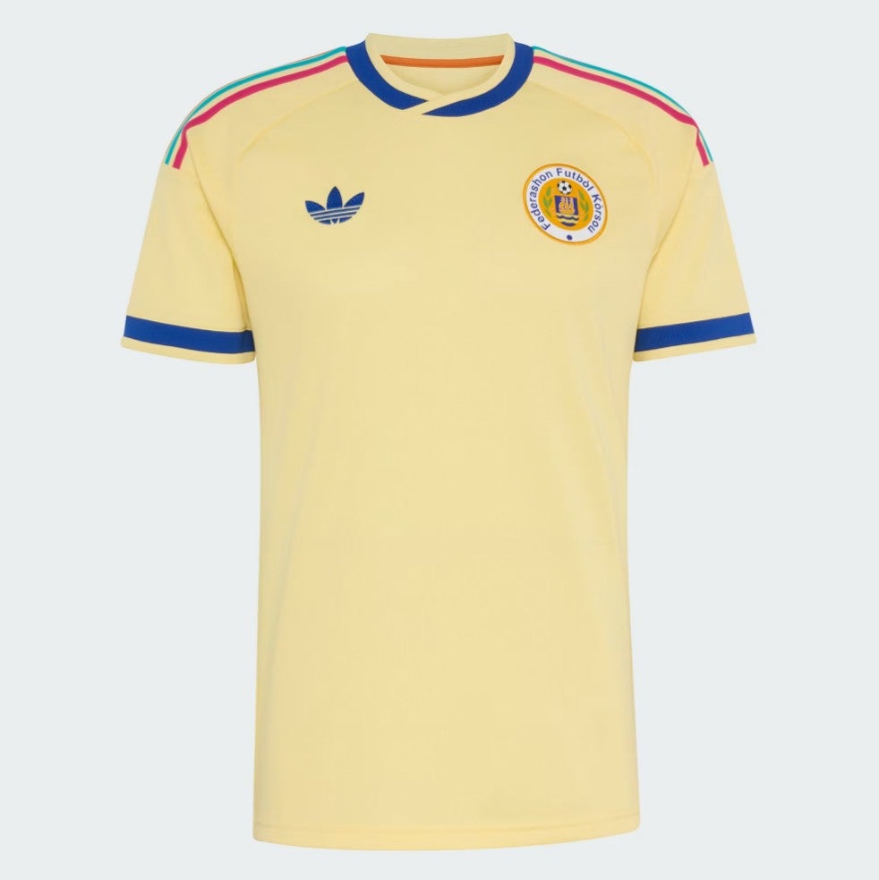
1. Curacao away: It’s perfect. The soft yellow tone, the bold blue sleeves, the old-school Adidas logo, the shoulder stripes. Even the collar is exquisite, and the bright colours writing out “Curacao” over the shoulder blades hint at a nation in North America for a good time, not a long time. We have our king.
 open image in gallery
Thanks for reading. Please do tell us where we’ve gone badly wrong in the comments below…